
EXPERTICITy
Now called ExpertVoice, experts are recognized for their knowledge with exclusive discount privileges so they can make recommendations based on first-hand experiences. Experts are 4x more likely to recommend a brand after engaging with it on ExpertVoice.
Here is the more recent work I’ve done is at the top. I’ve done various projects including the homepage, brand pages, brand stories, learning & assessments, and a content builder that brand reps or Experticity reps could build lessons & Edu-Games. There’s a lot to see here. For the learning & assessments portion, scroll about halfway down.
HOMEPAGE

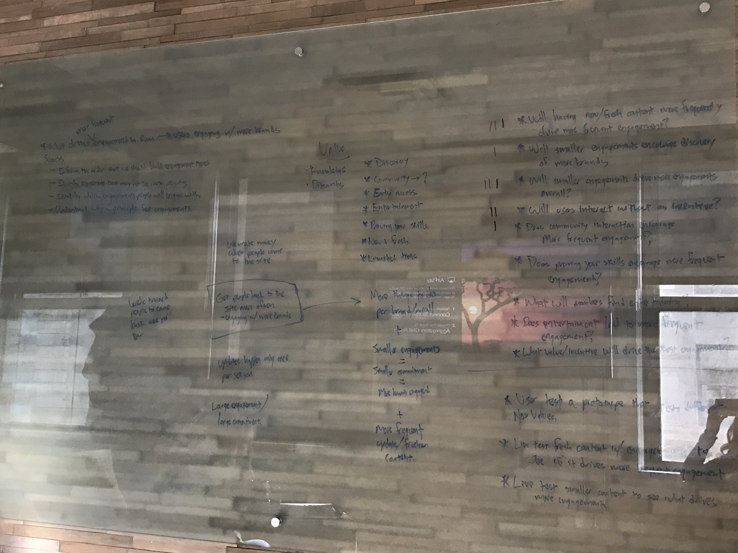

Problem: The homepage used to be filled with only cards from brands listing promotional sales. It was very hard to digest. Our site was not getting much engagement, other than the top 3-4 rows of cards. The cards didn’t change much, making the homepage very stagnant.
Goal: Make the homepage more valuable by making it easier for experts to find the things they care about and allow us to test and learn what types of things experts want to engage with.
Description: Through extensive user research, we came up with new ways to interact with the homepage including ways to fill out an expert’s profile (which helps brands find experts), brands an expert can follow to stay up-to-date on their favorite gear, deals they can unlock by learning their content, limited-time offers, special missions, etc. (all shown above in the first image)
My Role: My product manager, Lauren, lead brainstorming sessions with me and our head engineer on the engagements team. Lauren pulled metrics on how the current homepage was performing, I lead the user research by sending out surveys to our experts, as well as setting up appointments to call and speak to experts already on the platform. After several iterations of designs, we finally got to the end result with all the feedback we did from our user testing sessions. We also added different pieces of content to our current homepage and tested to find out which content performed better than others.
Findings: Experts responded more positively to each round of prototypes we showed them, getting the design where it currently is below. A/B testing did well with the “Brands You Follow” row. The last several rows were in the process of being developed by our engineers when I left the company.
Brand Page
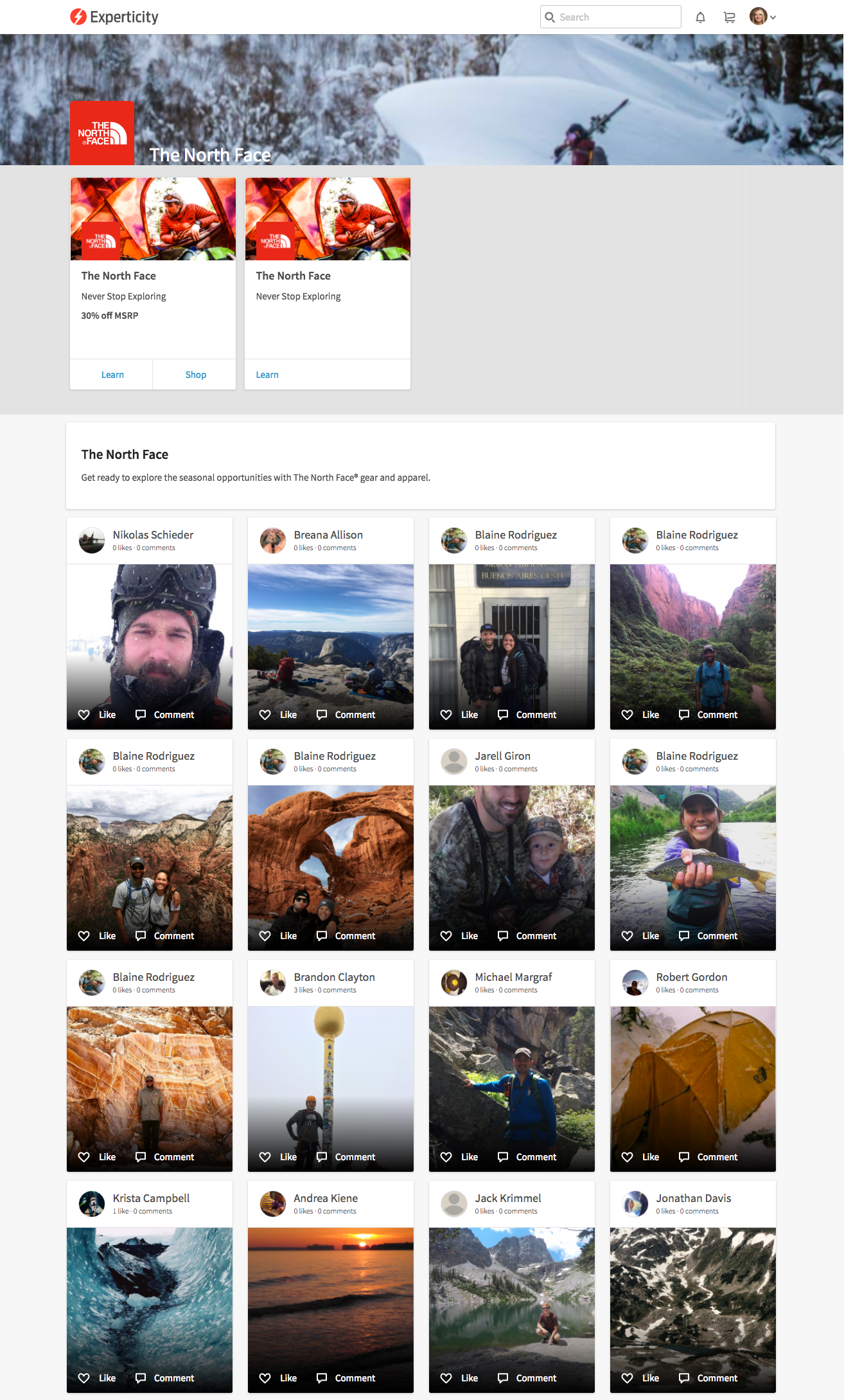


Problem: Brand pages had low engagement rates because of not having enough meaningful content or ways to shop for brands’ gear.
Goal: Drive more engagement by having a better brand experience where all brand content is centralized.
Description: An expert gets to the brand page by clicking on the brands from the homepage. This is where an expert can follow a brand to get updated content, see their activity with the brand, read updates, give feedback for the brand (to determine brand NPS), follow other brand elites, take Edu-Games, purchase gear, etc. The design in the first image shows the mobile design that an expert would scroll through. To the right would show what would happen if a user interacted with a piece on the left.
My Role: Initially, the lead principle UX designer lead a design sprint with our engagement team on ways we could make the brand page a better experience. At the end of the sprint, we kept certain pieces that resonated through user testing. From there, I created the designs and Lauren & I kept working on ways we could bring more content. She worked with brand representatives on producing more meaningful content. I designed and iterated prototypes that I would end up testing with users later on.
Postmortem: After looking back at these designs, there’s one glaring thing that I’d fix: the header. The navigation is filled with icons. I’d definitely put them under the hamburger menu to make it cleaner and simpler.
Brand Stories


Goal: Drive more brand engagement on the homepage by showing new and updated brand content.
Description: On our app, brand stories appeared at the top of the homepage. These brands would show up based on the brands that are targeted to the experts. It worked like Instagram stories where an expert would tap on a brand story, and a short video would appear. The videos could be talking about the brand or new gear they were introducing. During the video, an expert has the option to go to their store, learn more about the brand and/or products by taking lessons & Edu-games, follow the brand, or shop the specific products that the video featured. The web version was coming later, depending on how the brand stories on the app performed.
My Role: The idea and concept came from our Product Director, Jeremy. He, Lauren, and I talked about ways we wanted to feature the brands and their products. Lauren and I talked to the head of engineering, and we closely worked together to make sure my designs came to life. Lauren got the content by talking to the brand reps, who provided content for us to feature. We rolled it out onto the app’s homepage and it performed very well.
Findings:
29% of unique users engaged deeper (followed a brand, purchased or consumed content)
15.65% of unique users engaged with brand stories
48.6% of page views resulted in engagement with brand stories (watching them)
LEARNING + Assessments
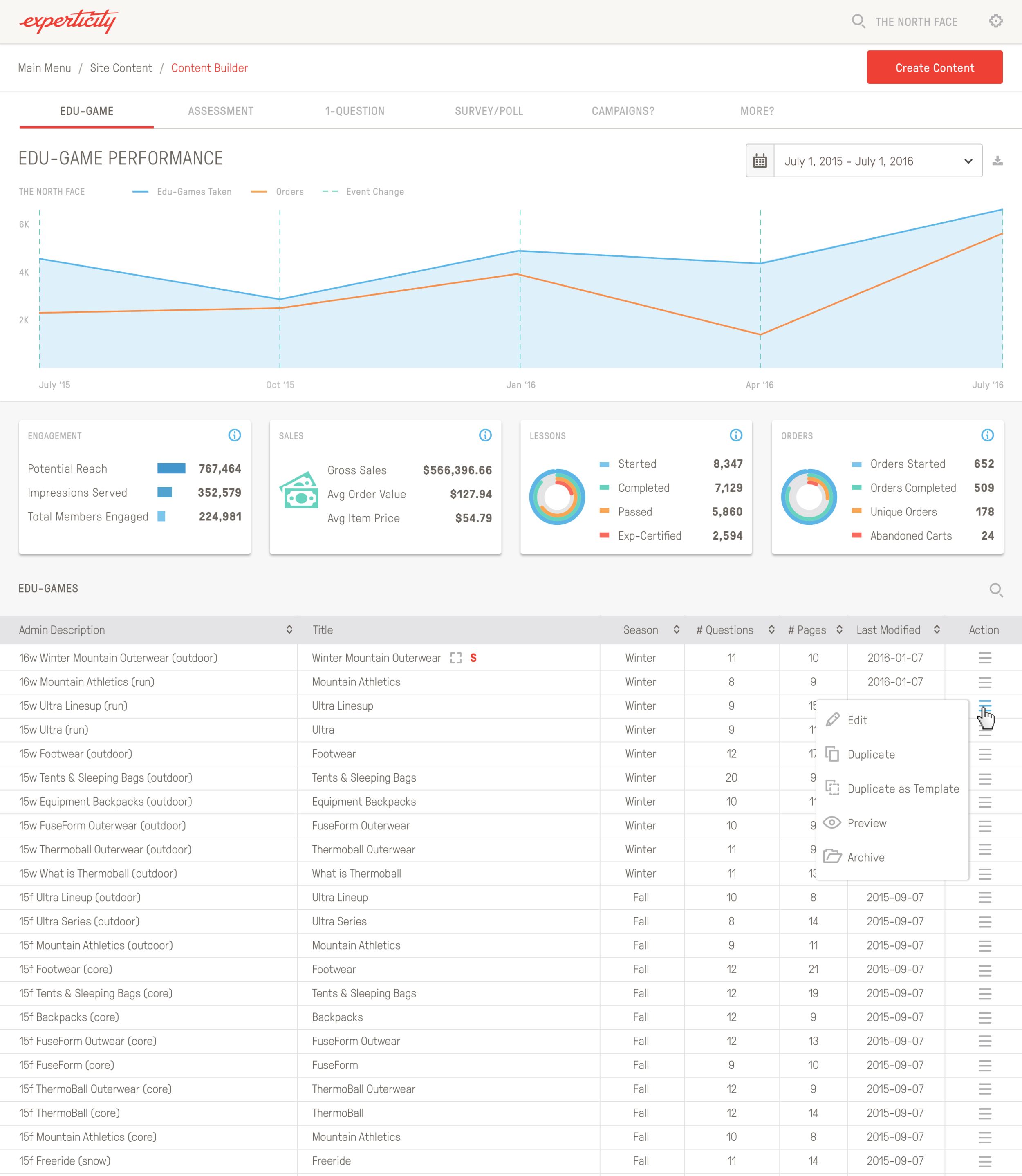
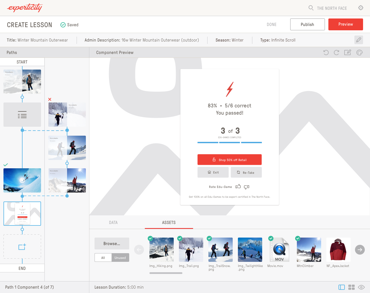
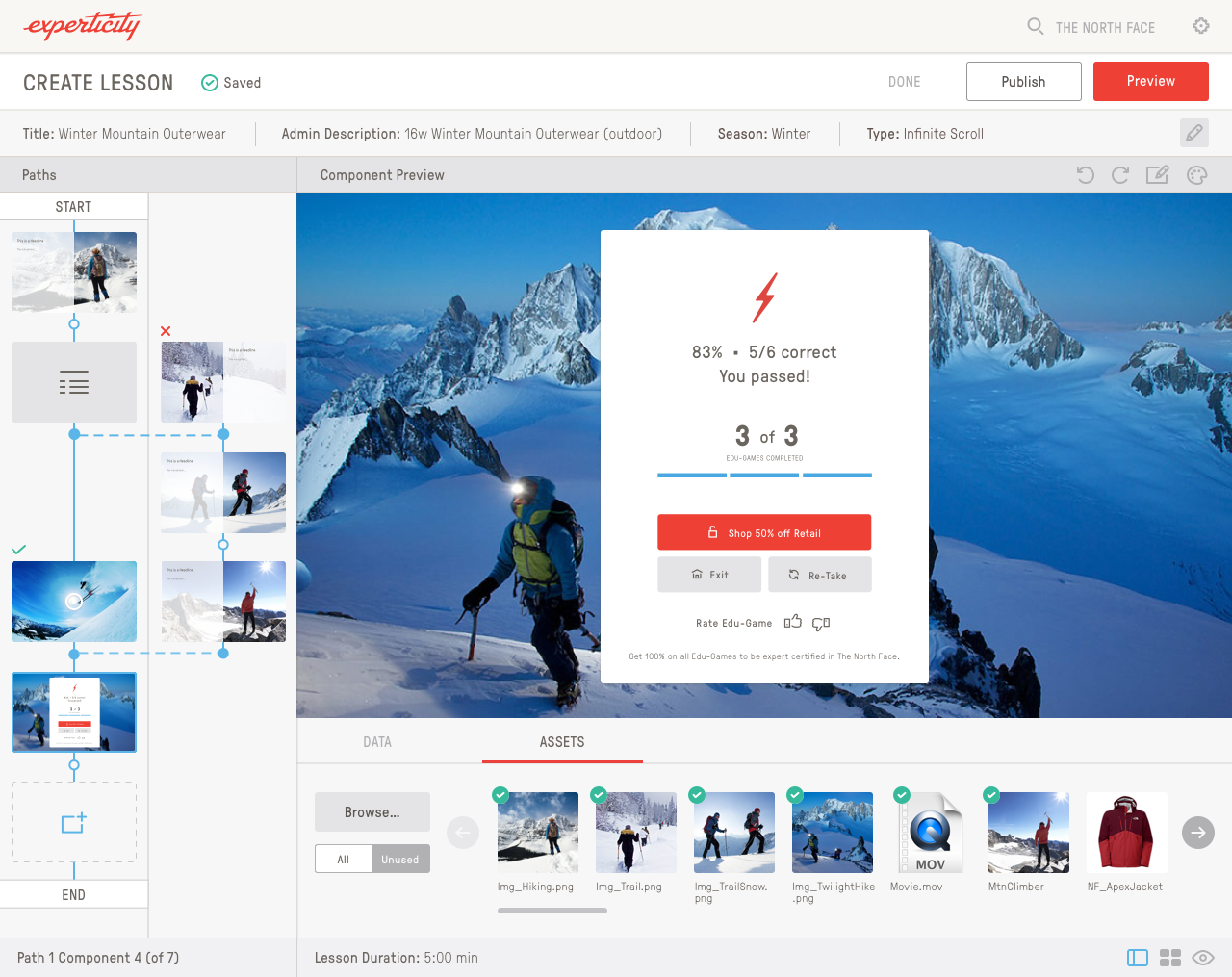
Experticity has a learning platform for professionals who need to stay up-to-date on brand product knowledge so they can, in turn, educate their customers who are wanting to buy those products. After they take a lesson, they take a test (aka “Edu-Game”) to see how much they learned. If they get 100%, they can move forward. If they get any lower, they have a chance to re-take it to get a higher score. If they fail, they have to take it again. After they pass all Edu-Games, they get discounts to that brand.
I redesigned the lessons and Edu-Games experiences. The above was the end result. Before, it was very dated, inconsistent, and not very user-friendly. For the lessons, they used to make you click page after page (which loaded slow), so instead I made it scrollable. The tap areas were also very small, so I made them much bigger. The scoring screen didn’t have a lot of stats, so I wanted it say more on there, where they’re at in completion, and easy to navigate to the next lesson.
Reimagining what the end of Edu-game experience is like. We felt like it should work more like a streaming app where, after you are finished with a lesson and edu-game, the next lesson is about to start. The above is a few ideas I came up with.
I designed this animation for Experticity’s end of an Edu-Game back when I first started. It’s older than the above design mocks.
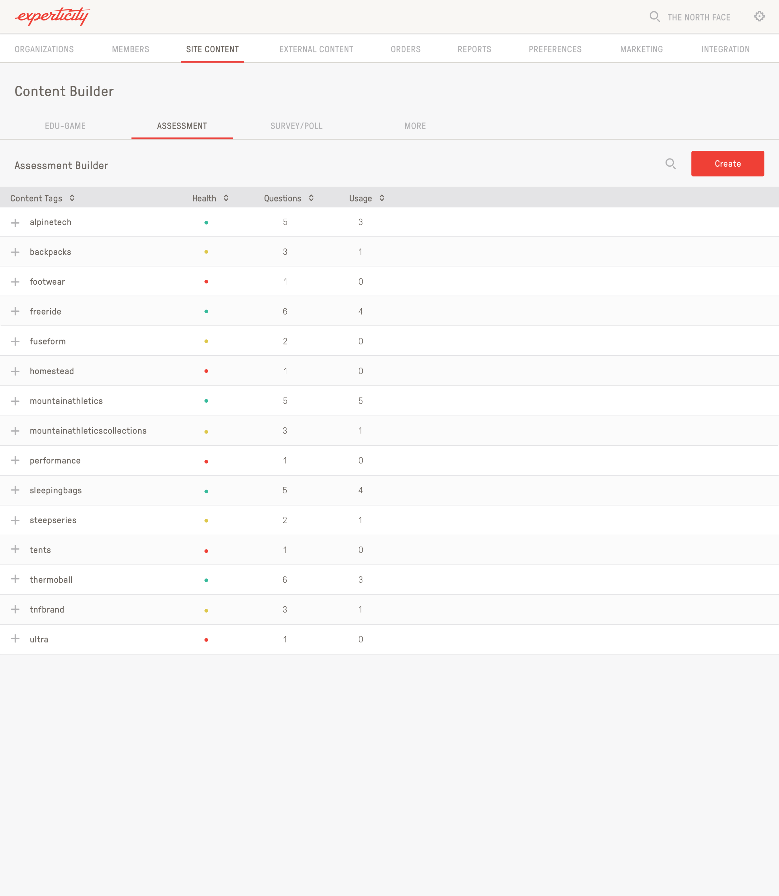
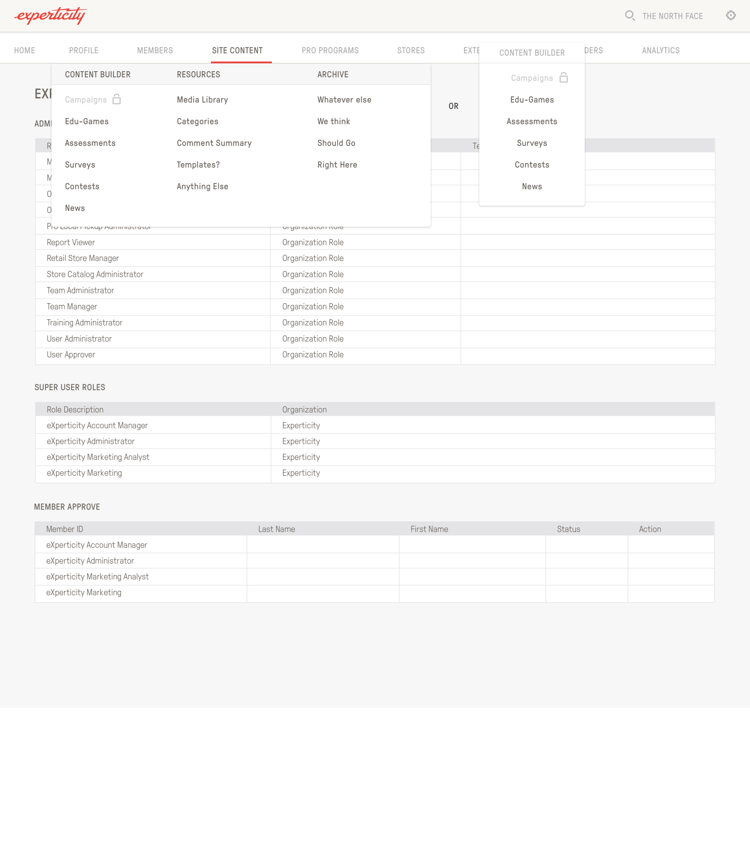
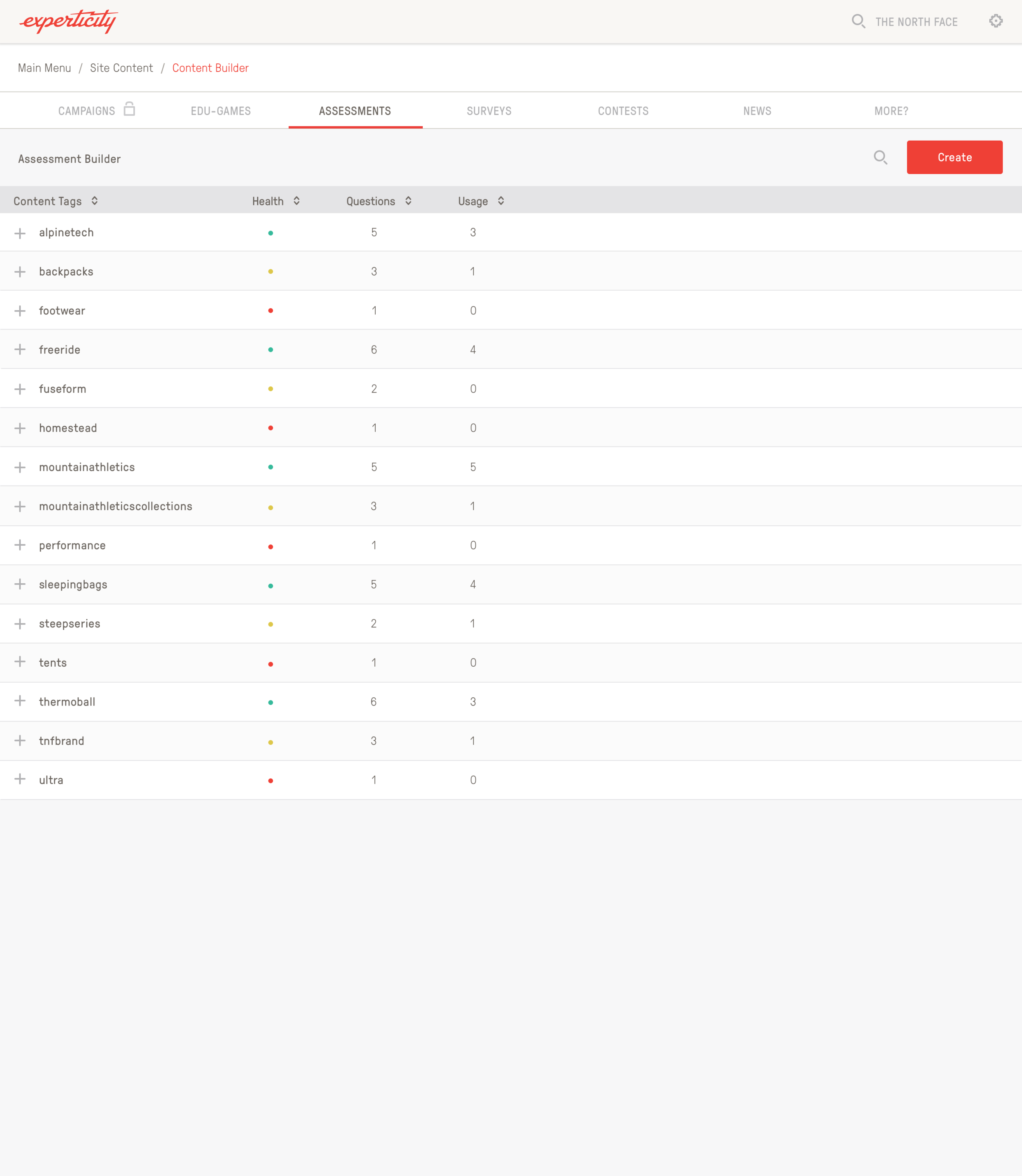
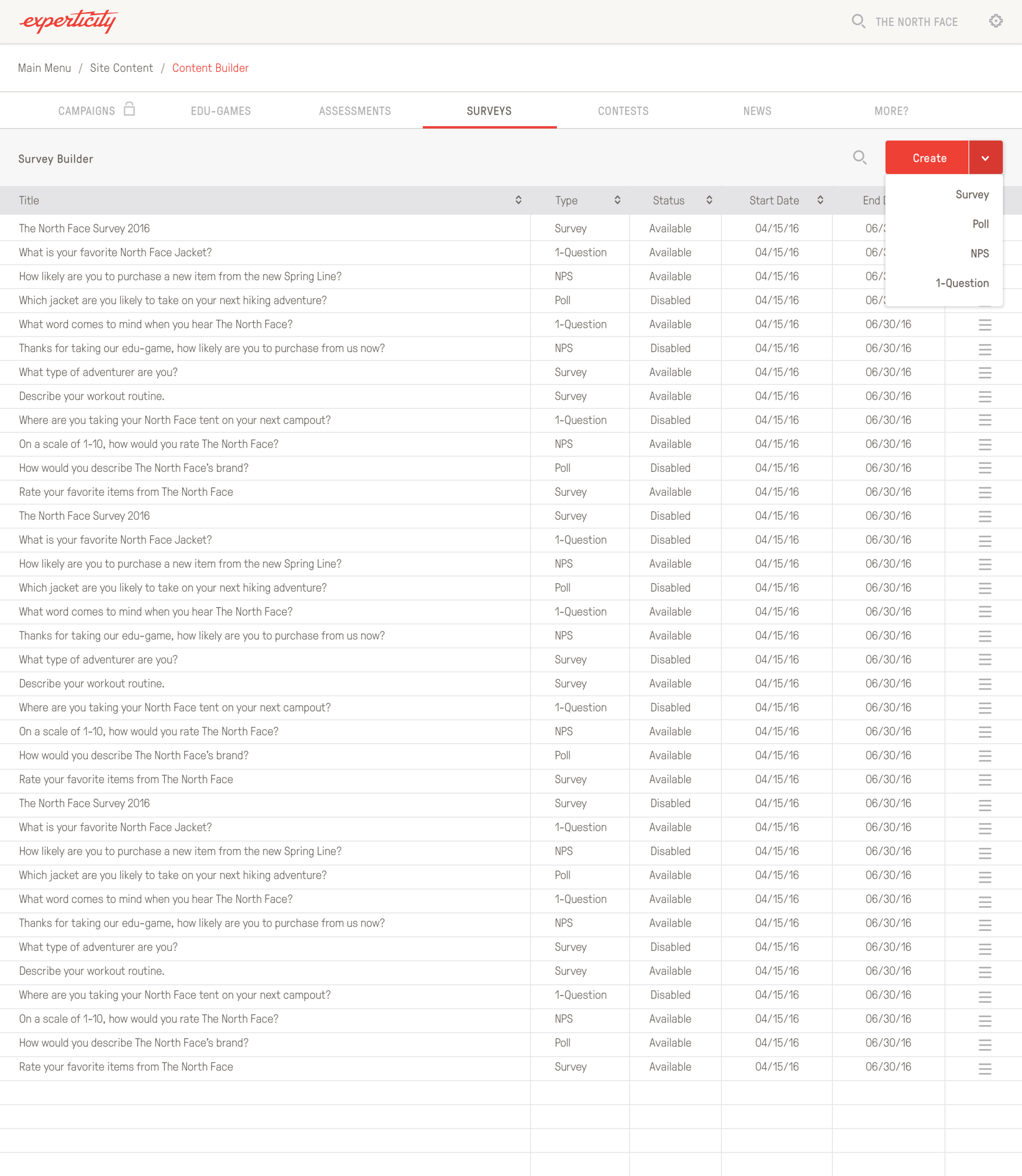
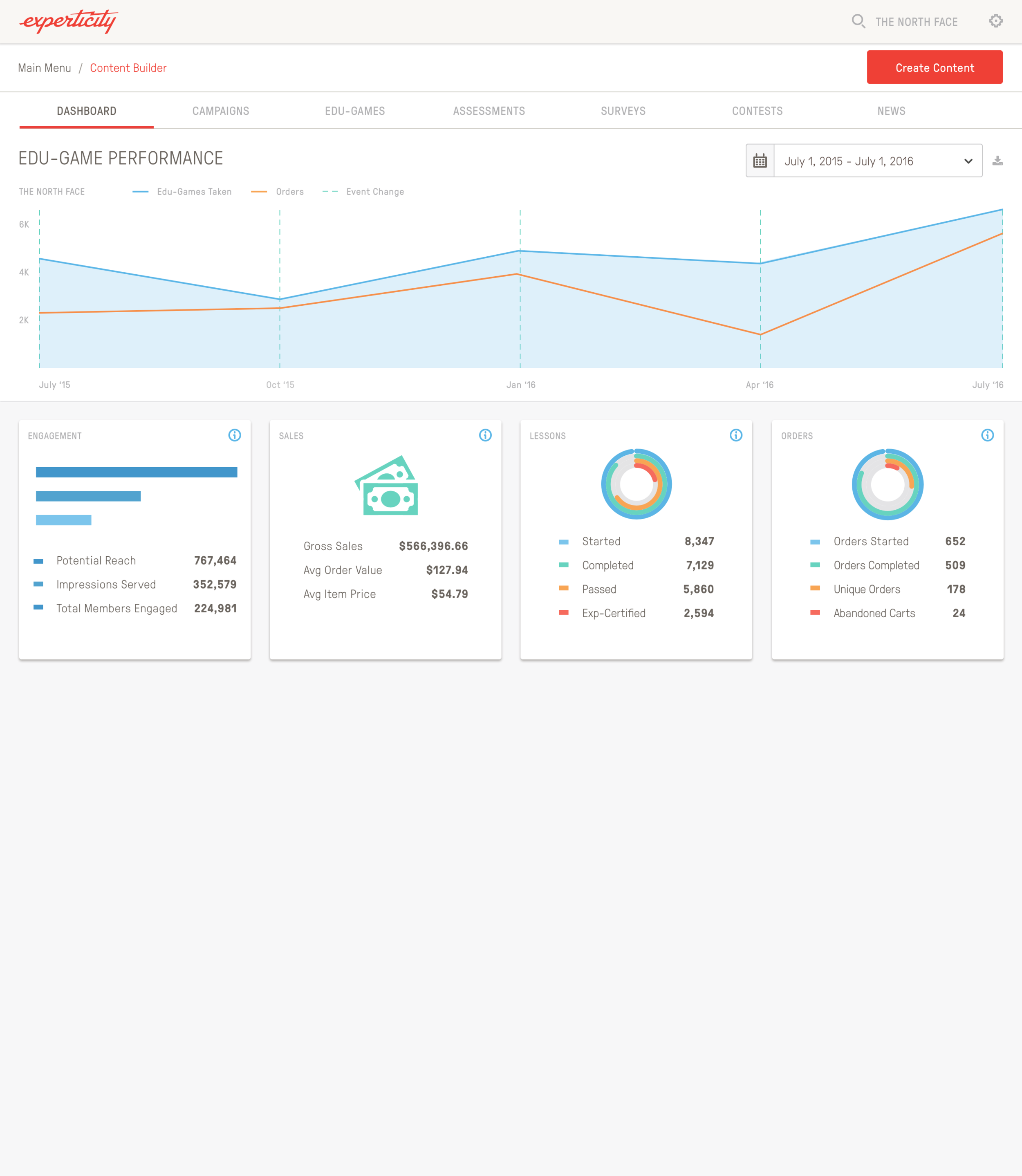
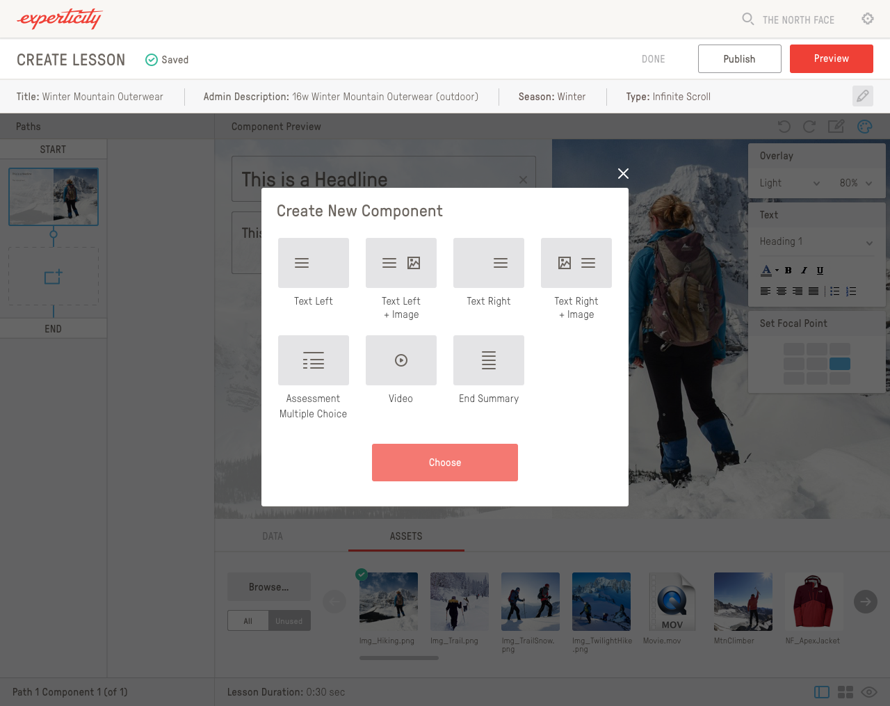
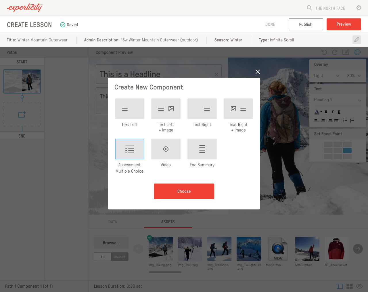
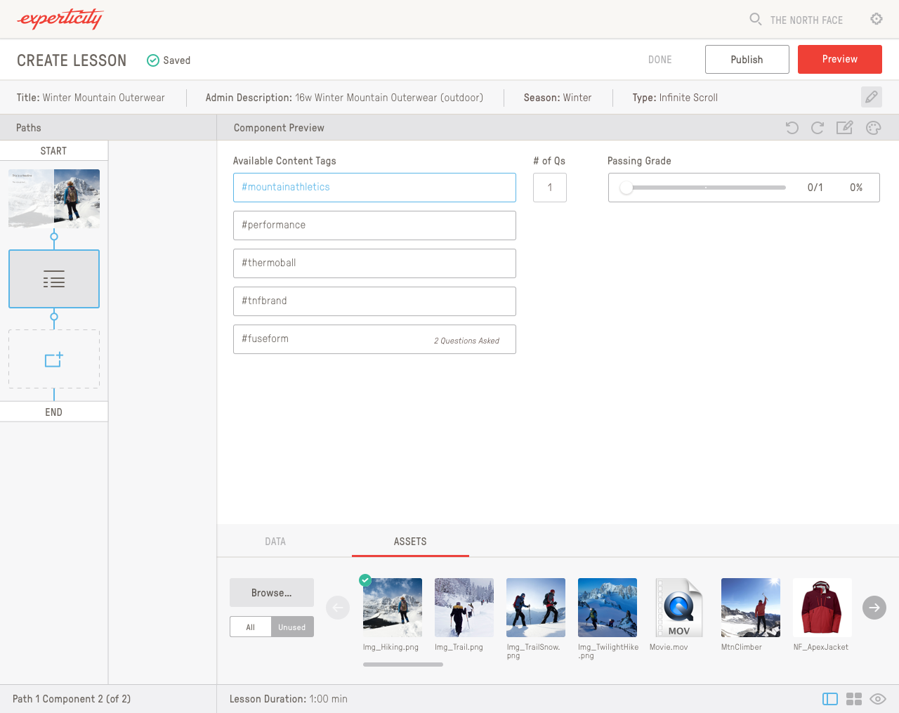
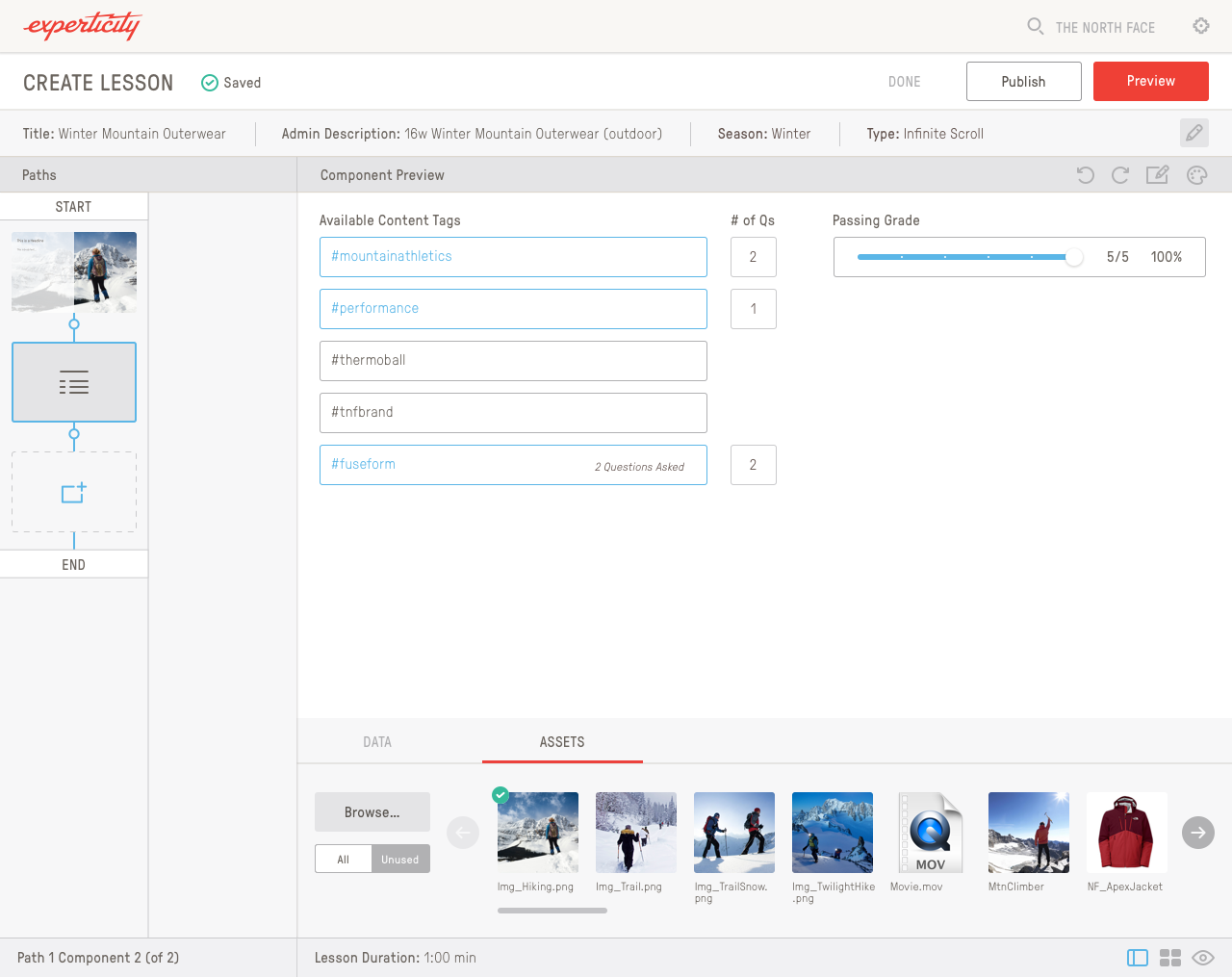
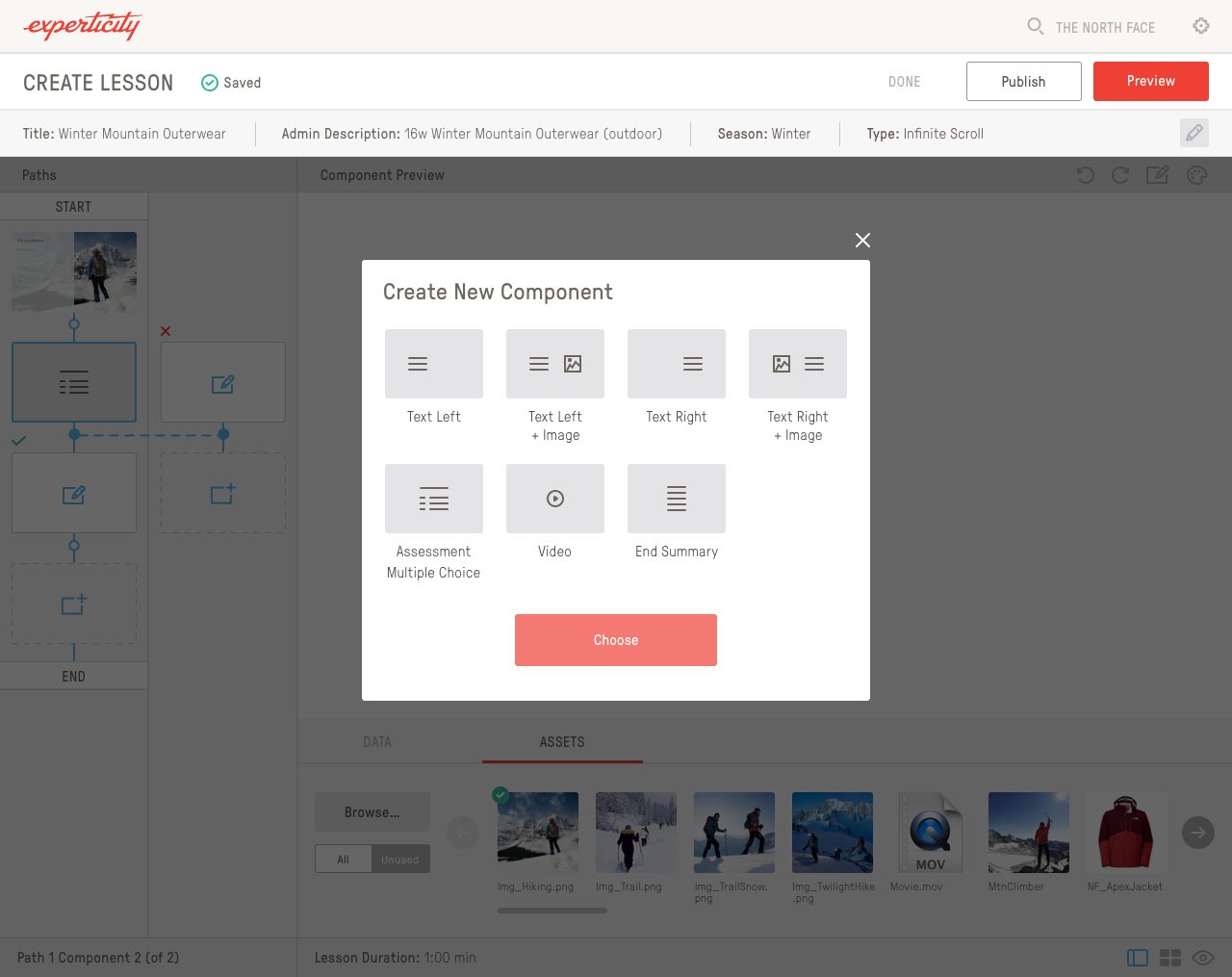
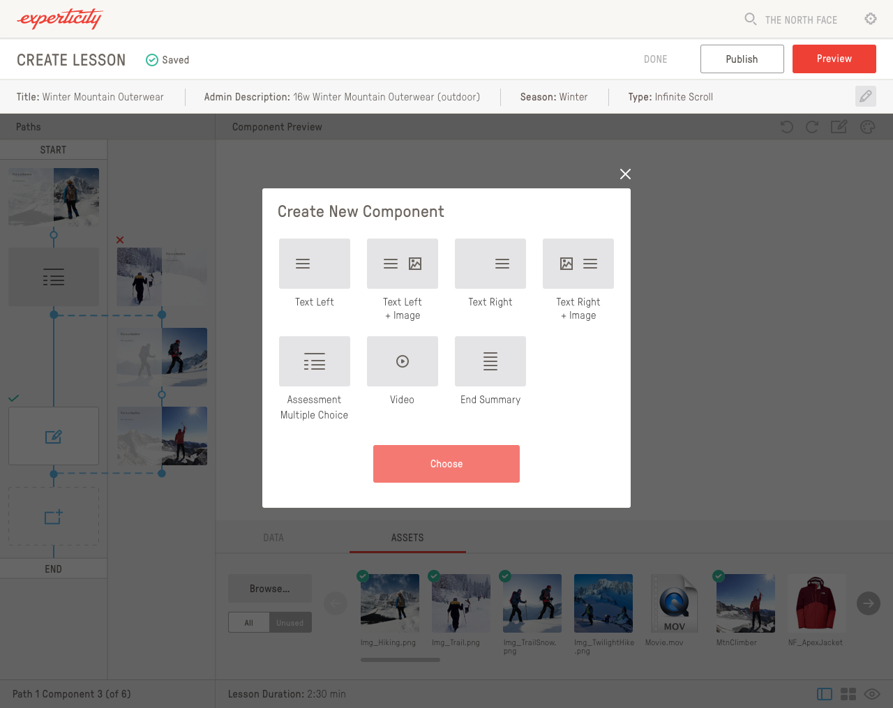
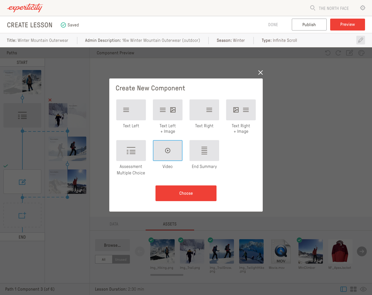
Content Builder
The content builder housed everything learning and assessments related, which are shown below the content builder. You can arrow through the different mockups to see how the builder worked since I don’t have prototype links handy.
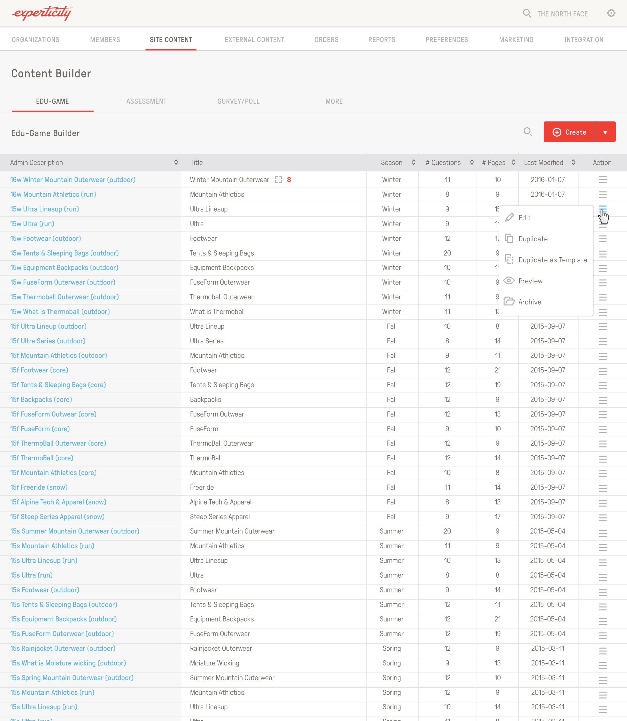
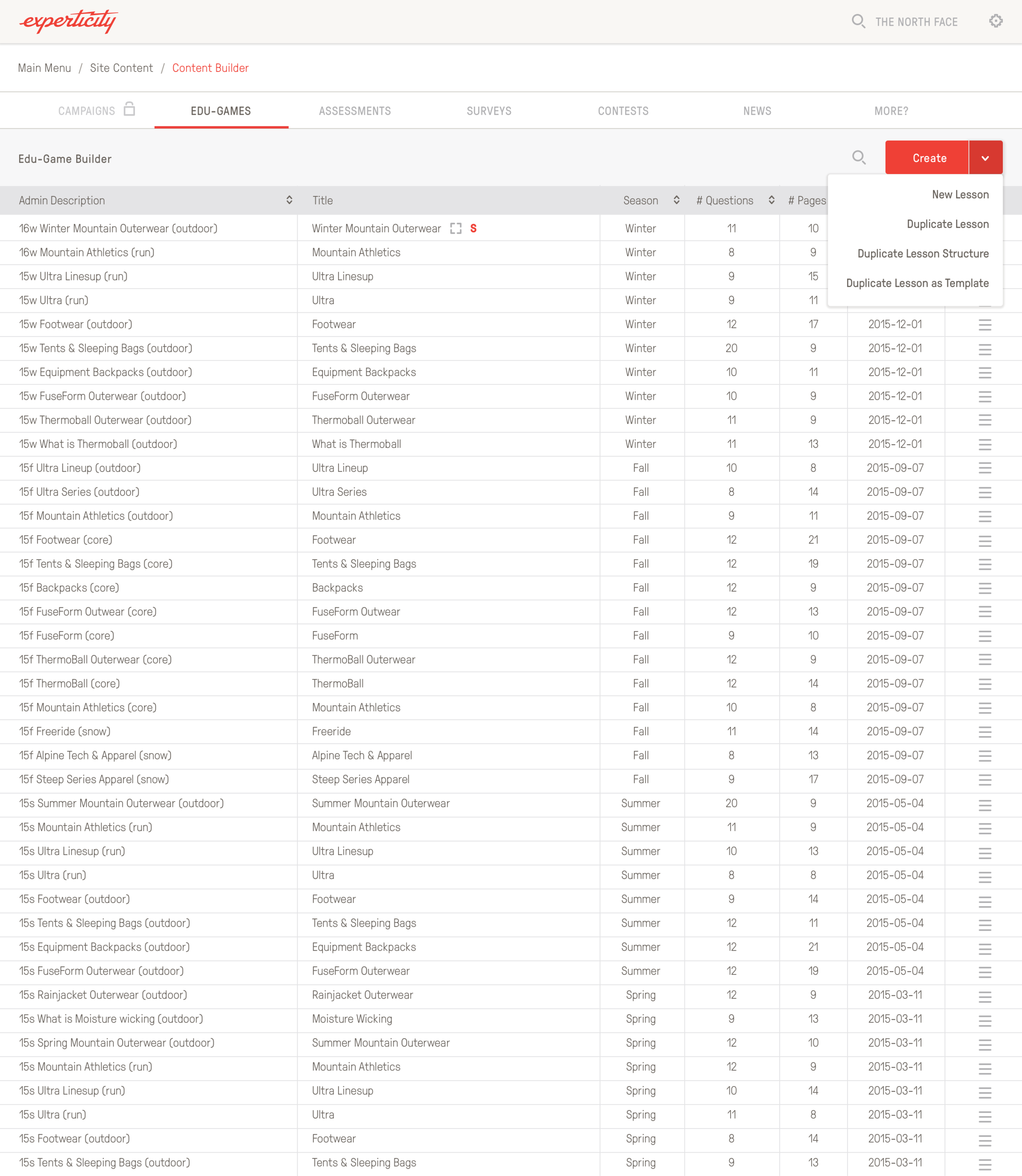
Lesson Builder
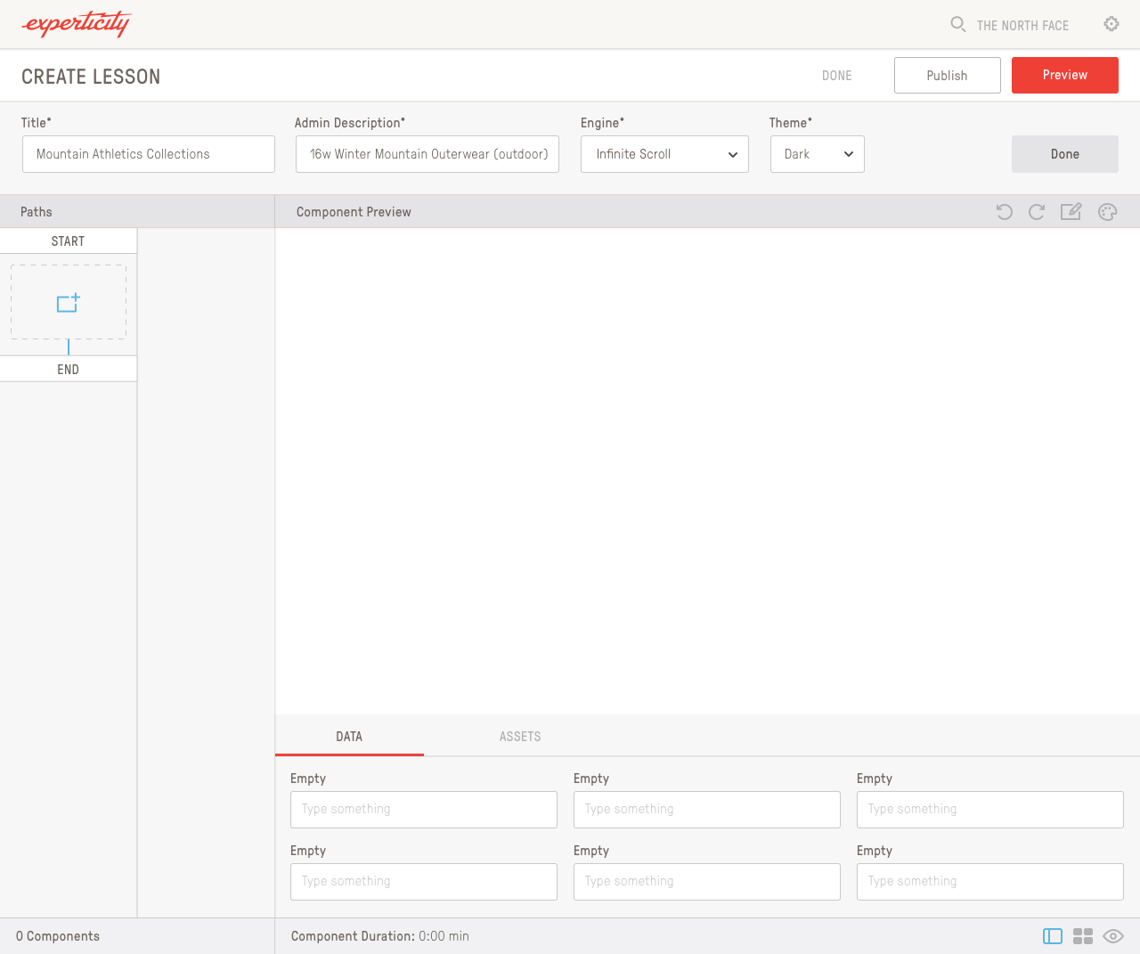
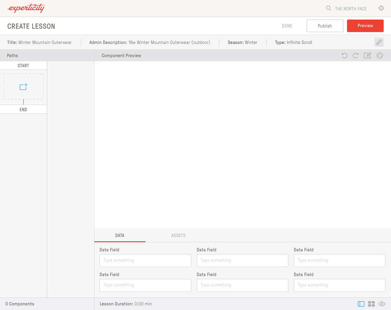
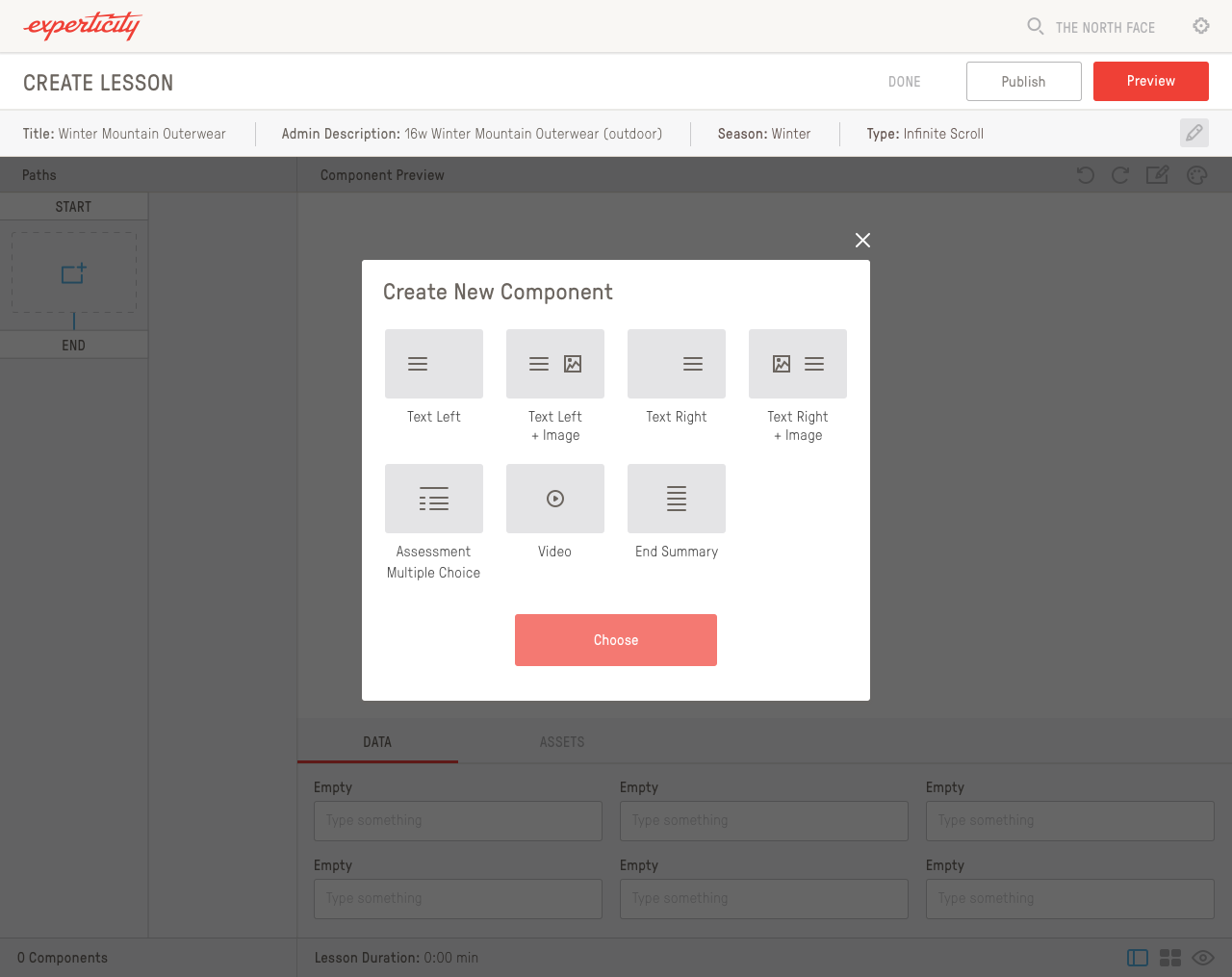
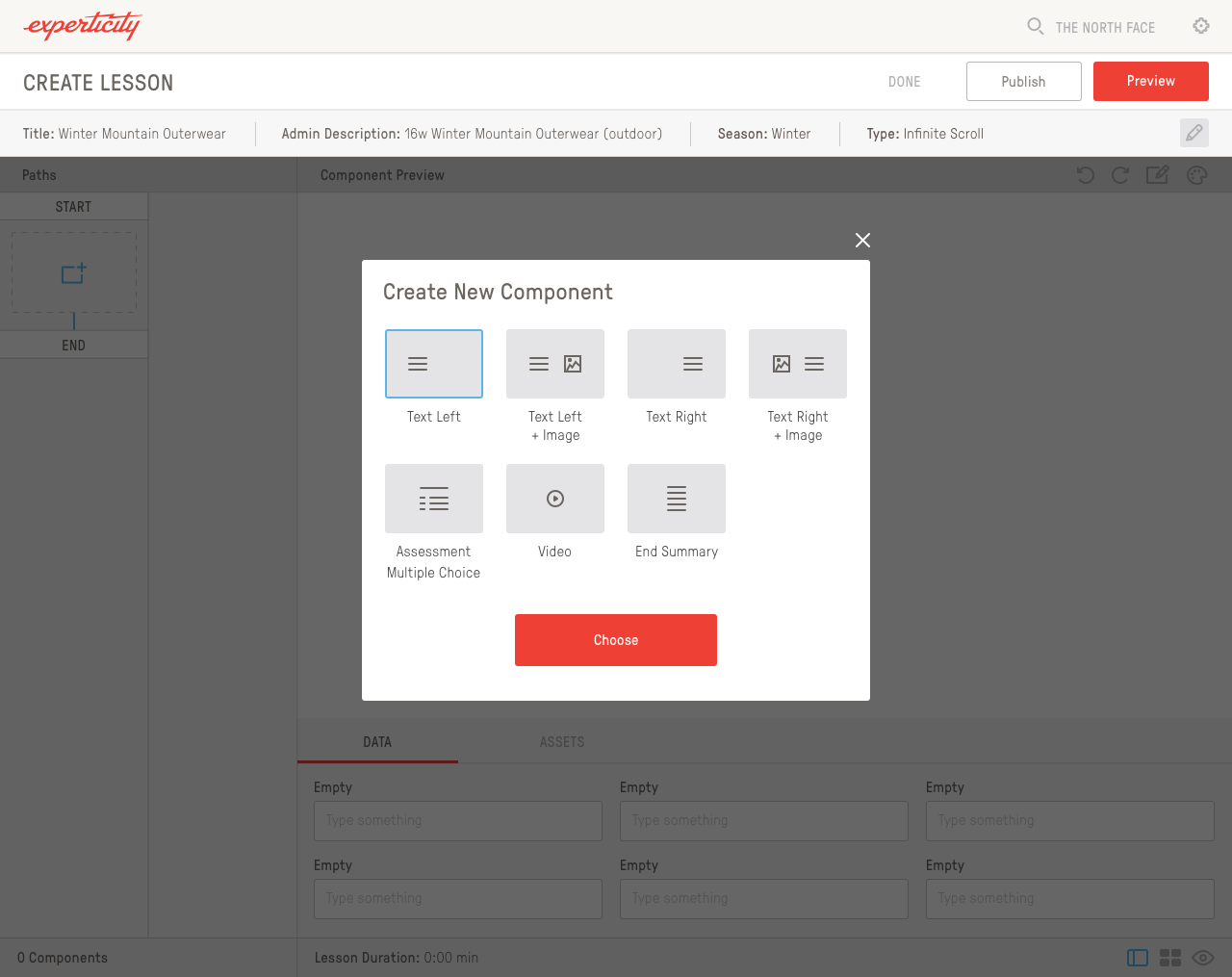
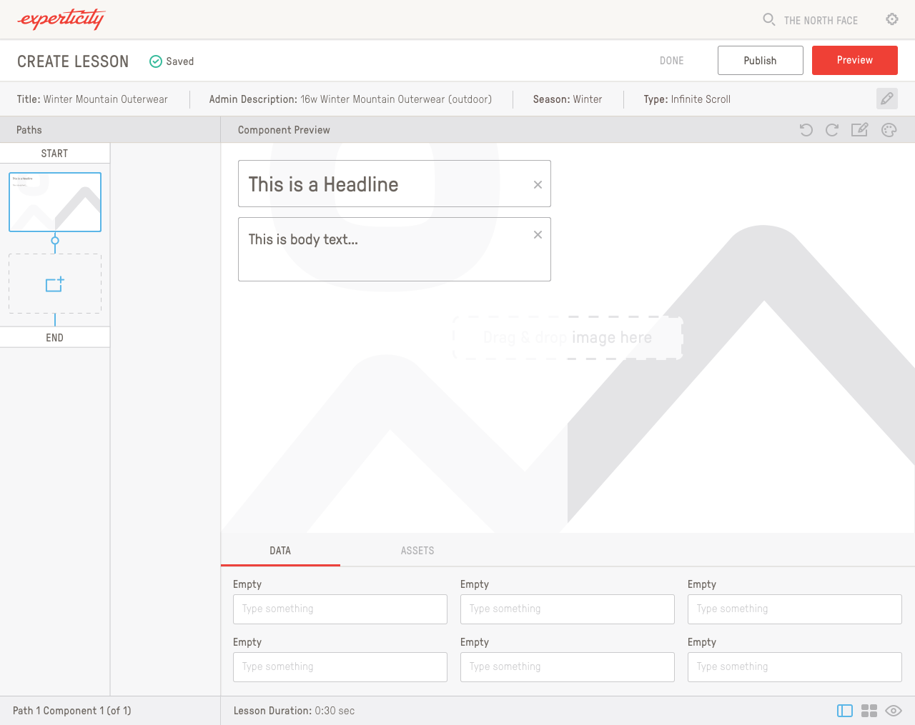
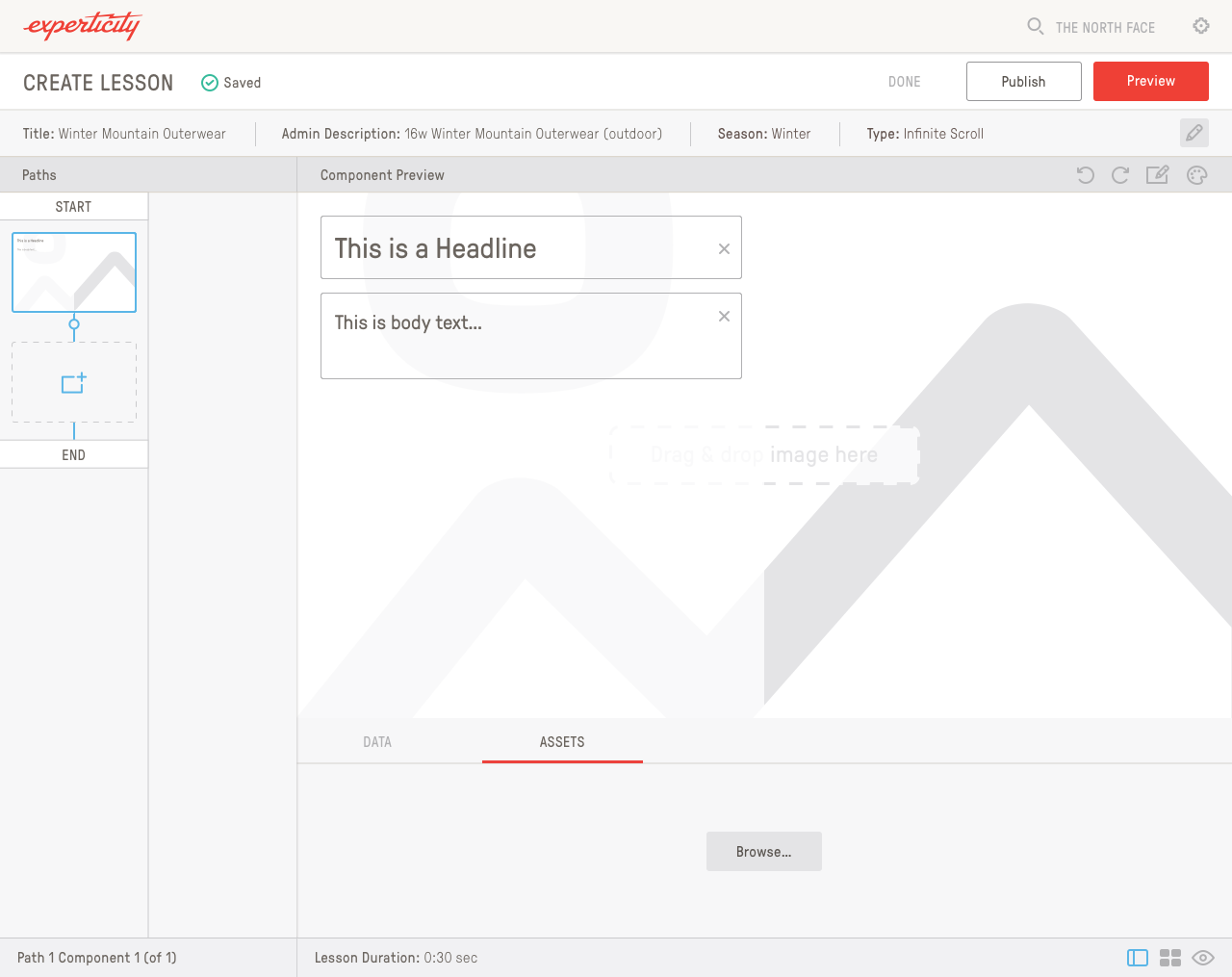
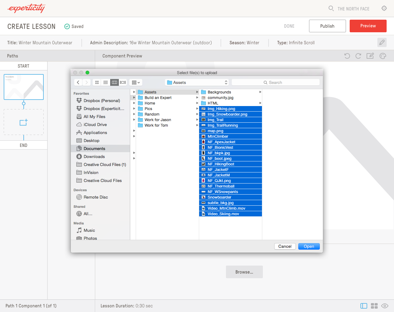
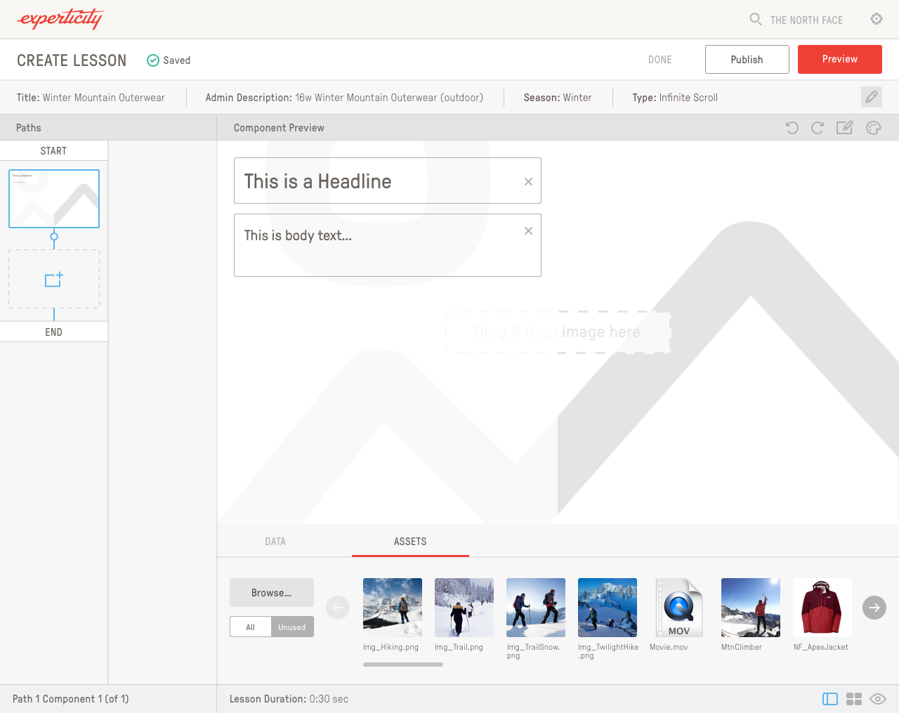
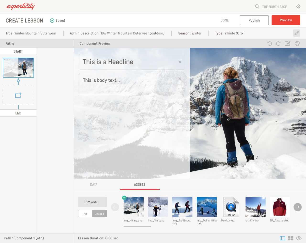
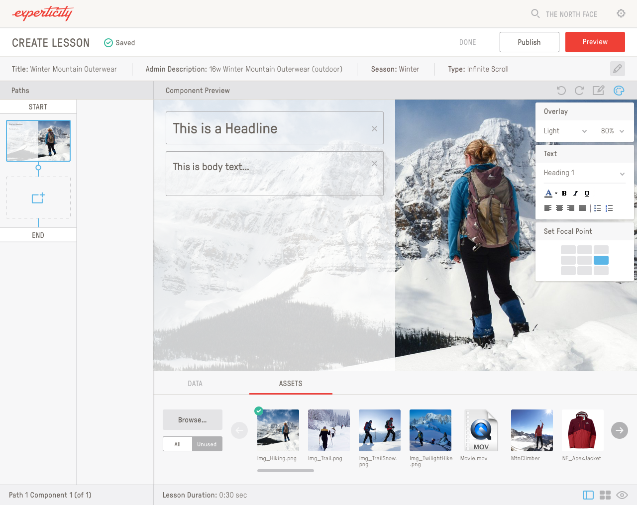
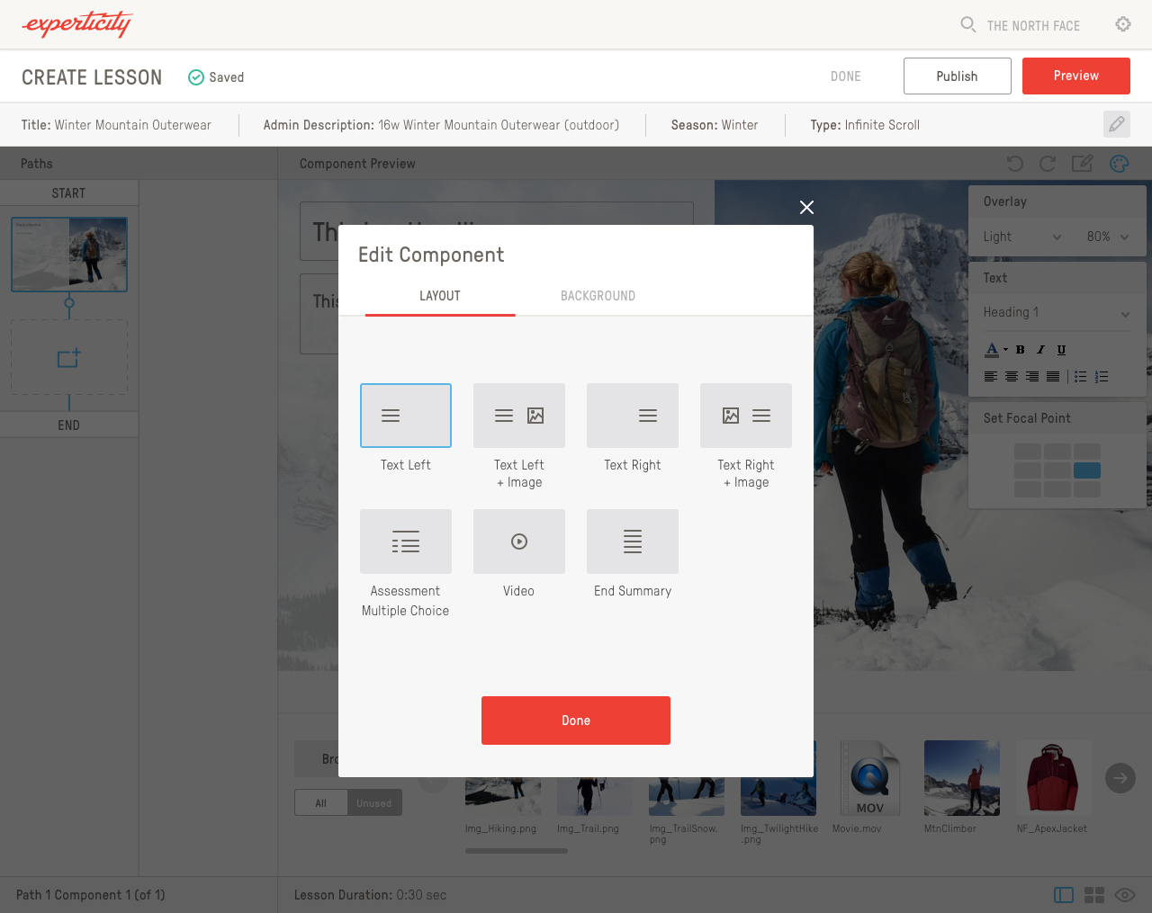
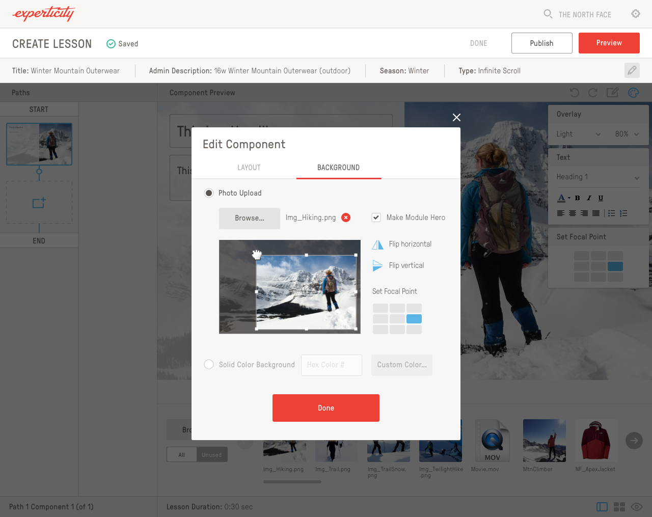
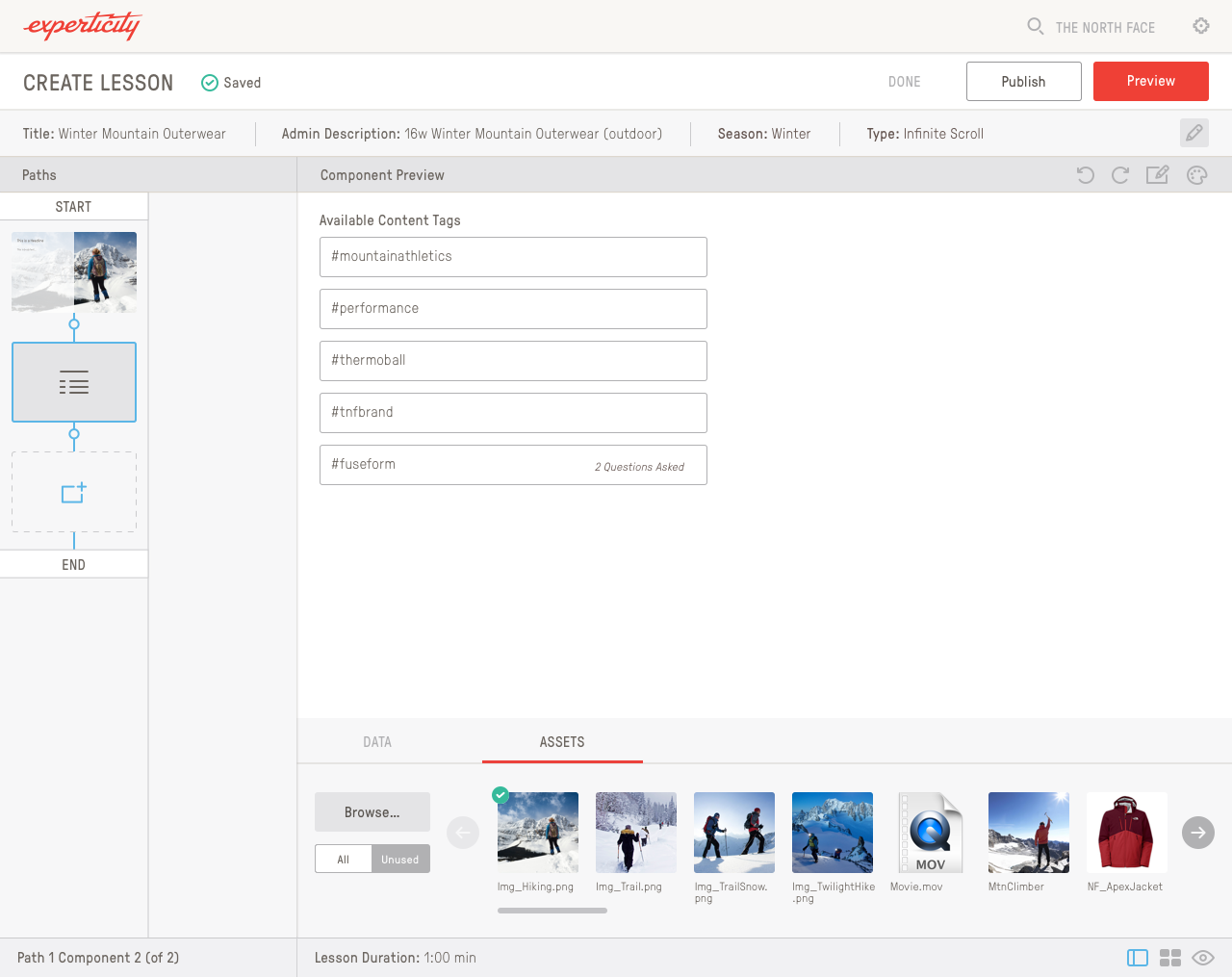


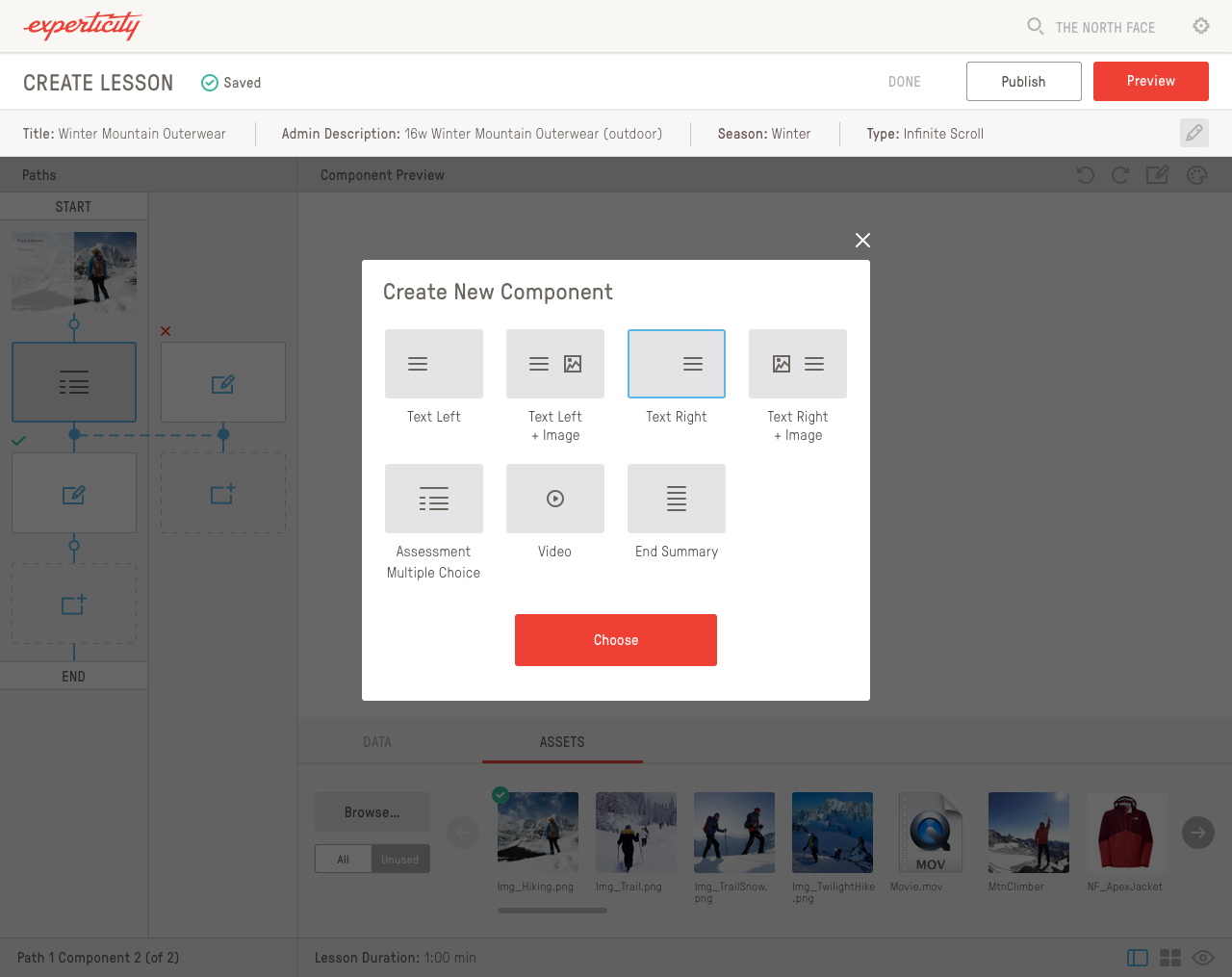
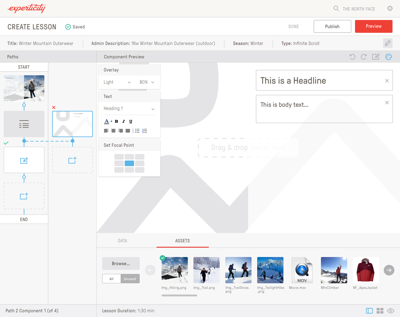
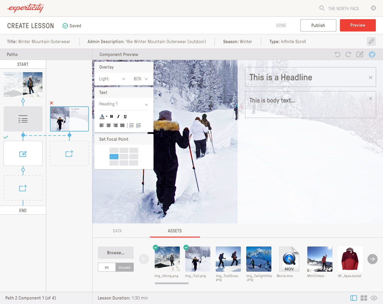
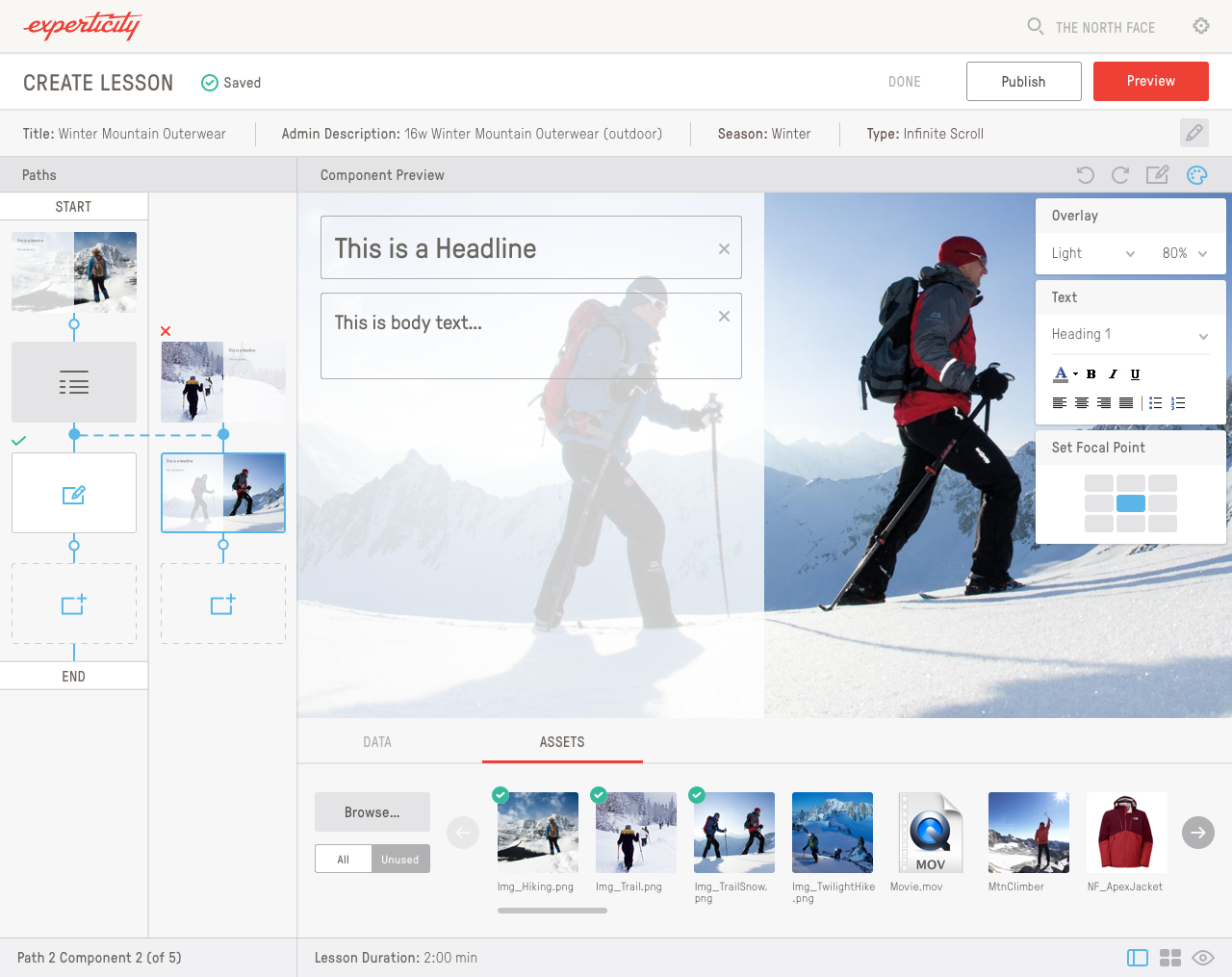
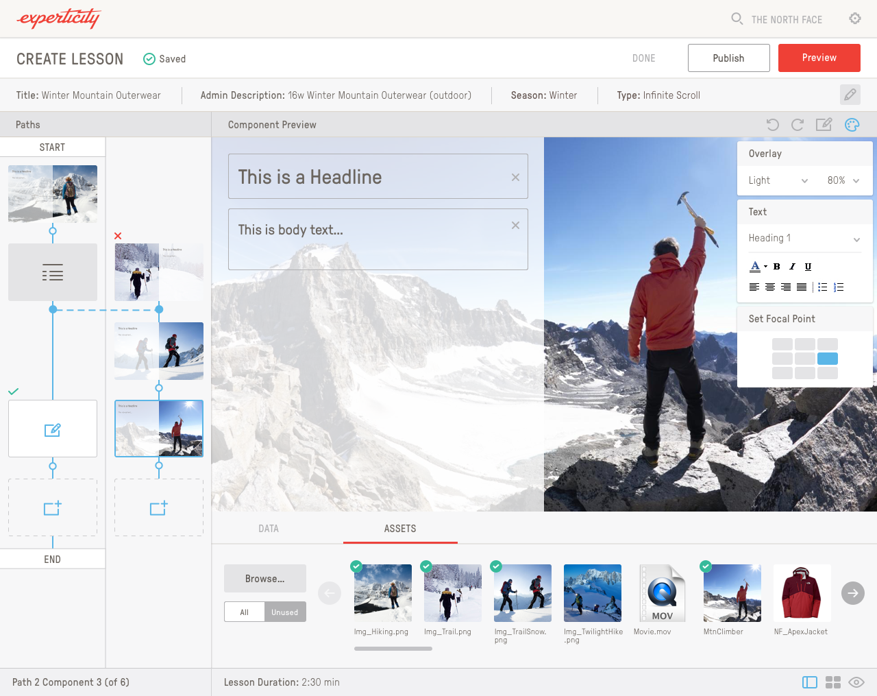

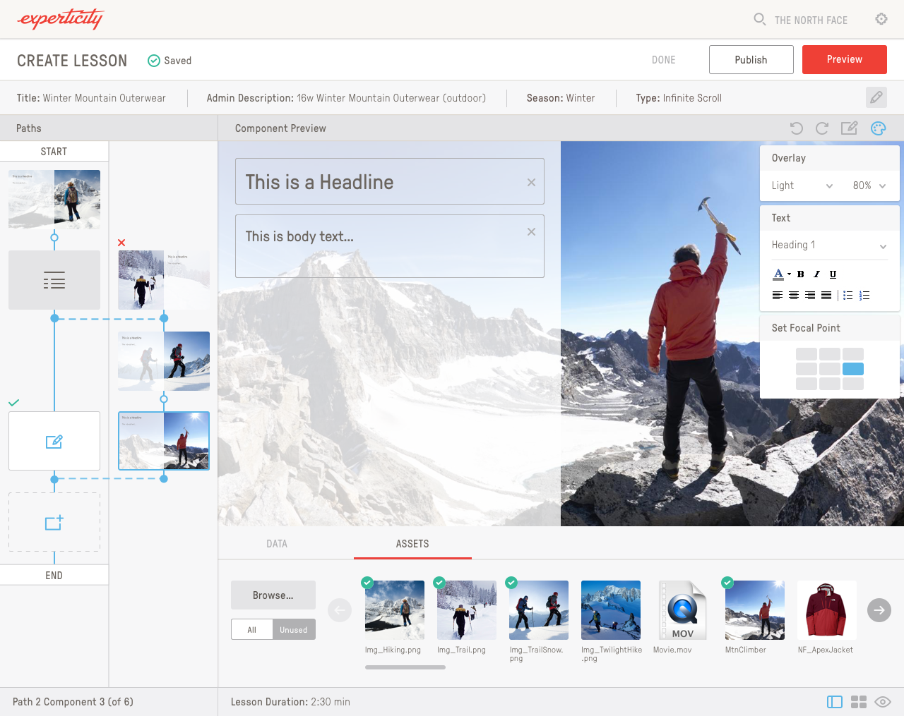
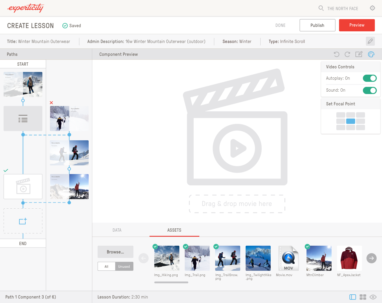
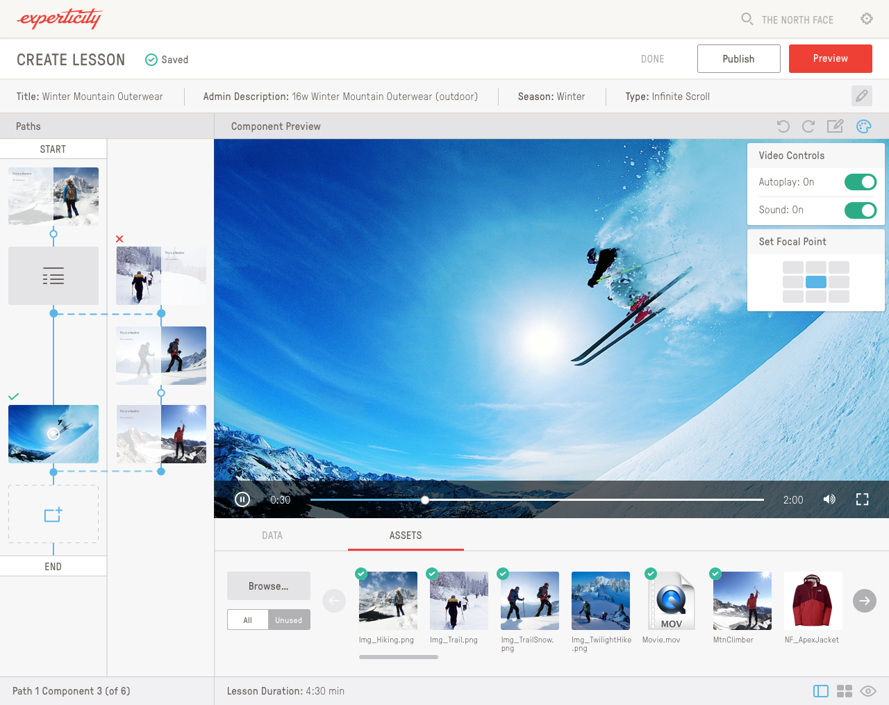
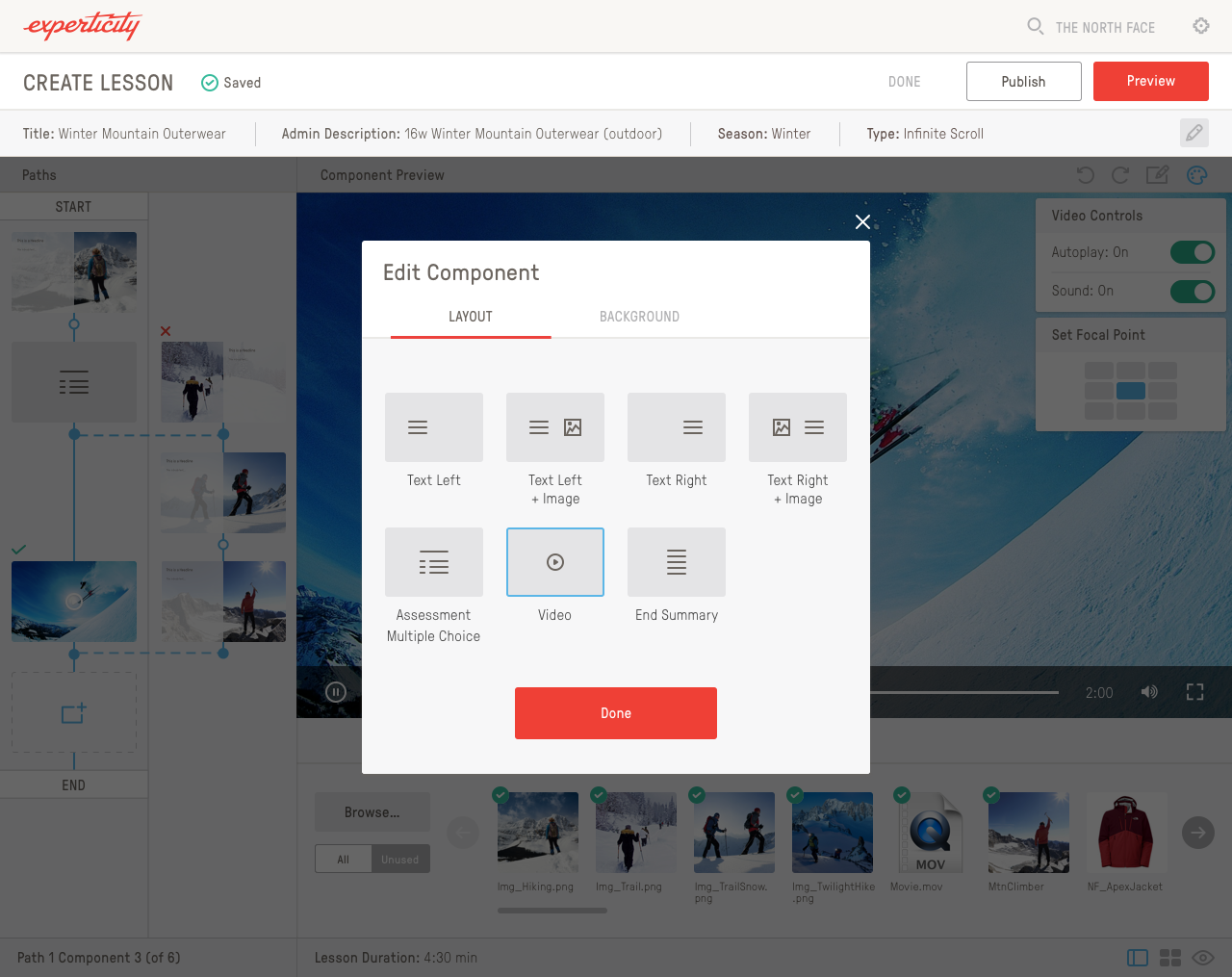
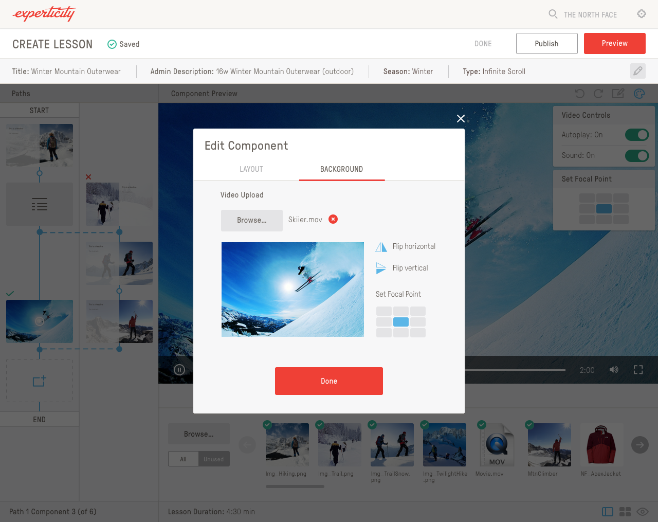
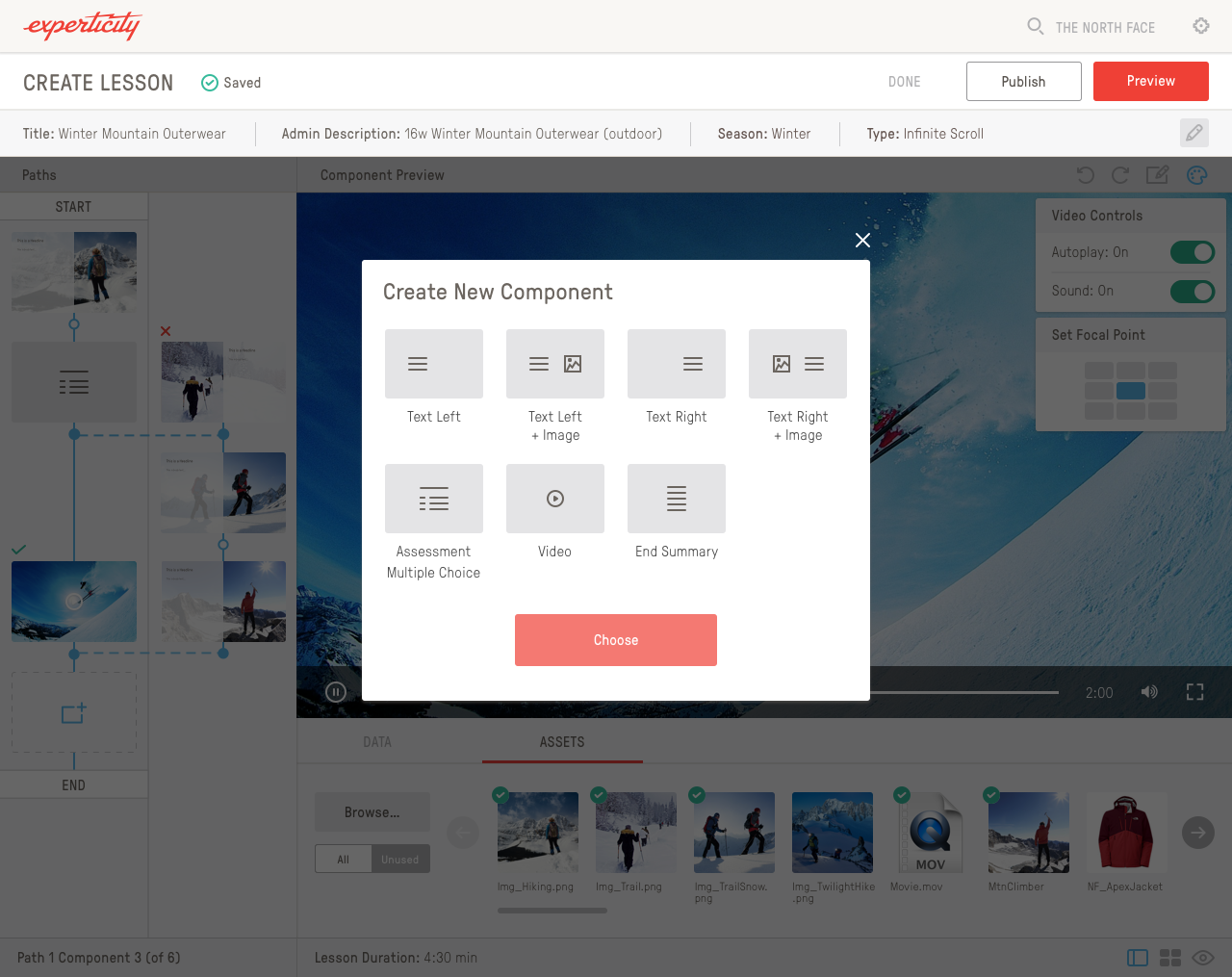
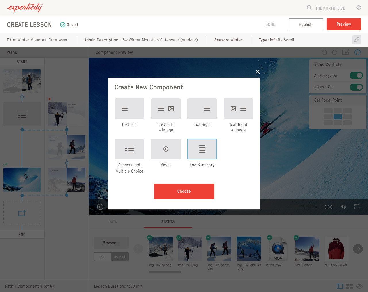
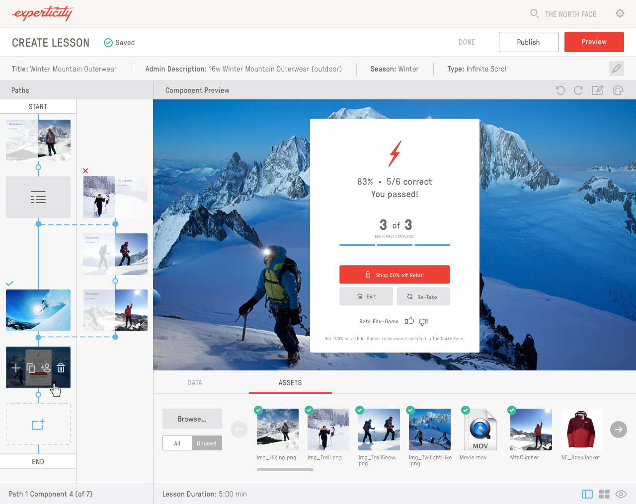

I designed this platform from scratch so that brand reps could come in and build & update lessons without having to wait for reps at Experticity to do it.
Assessment Builder
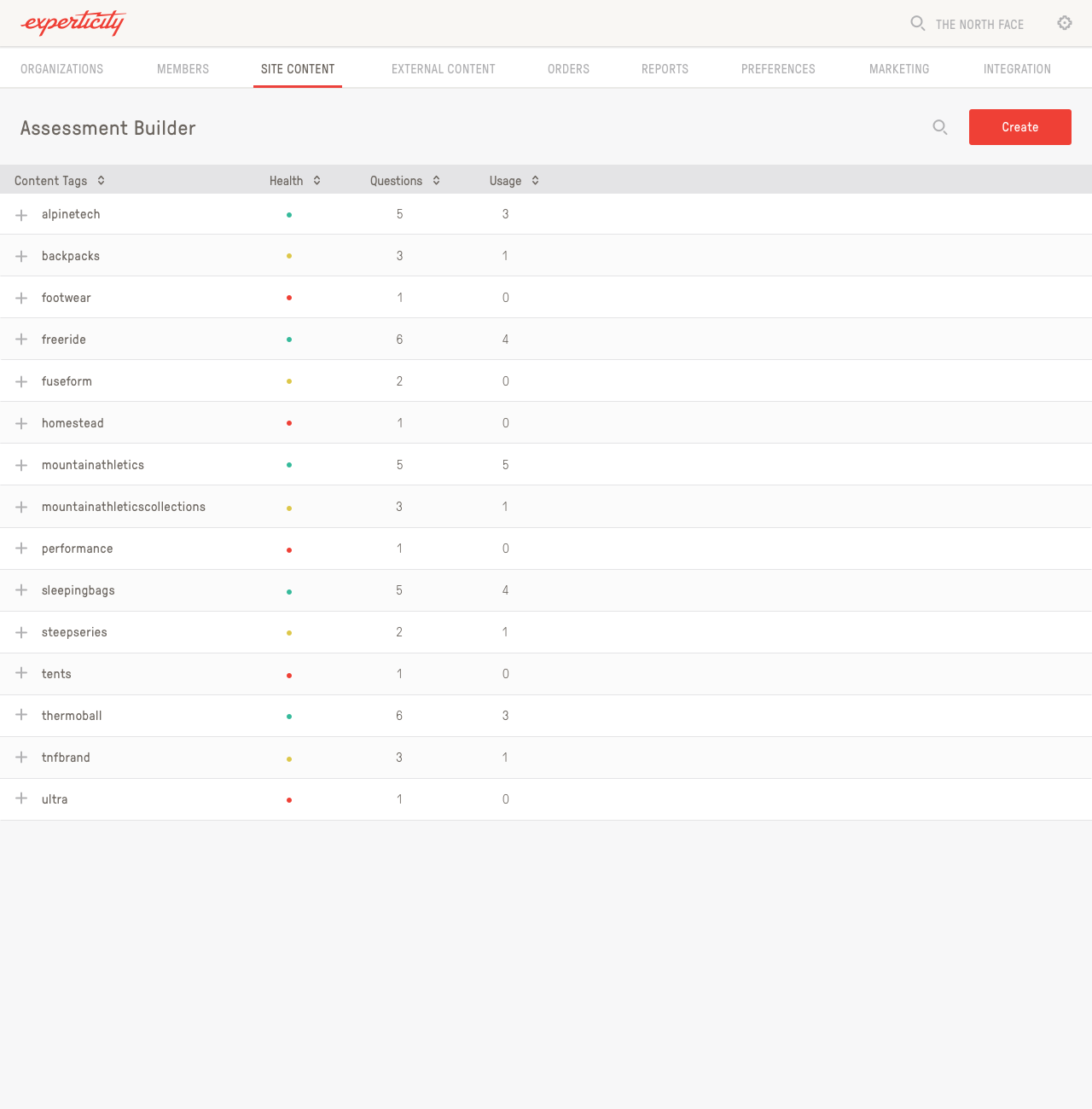
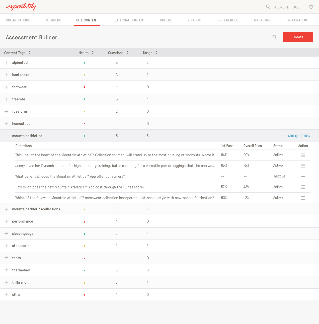
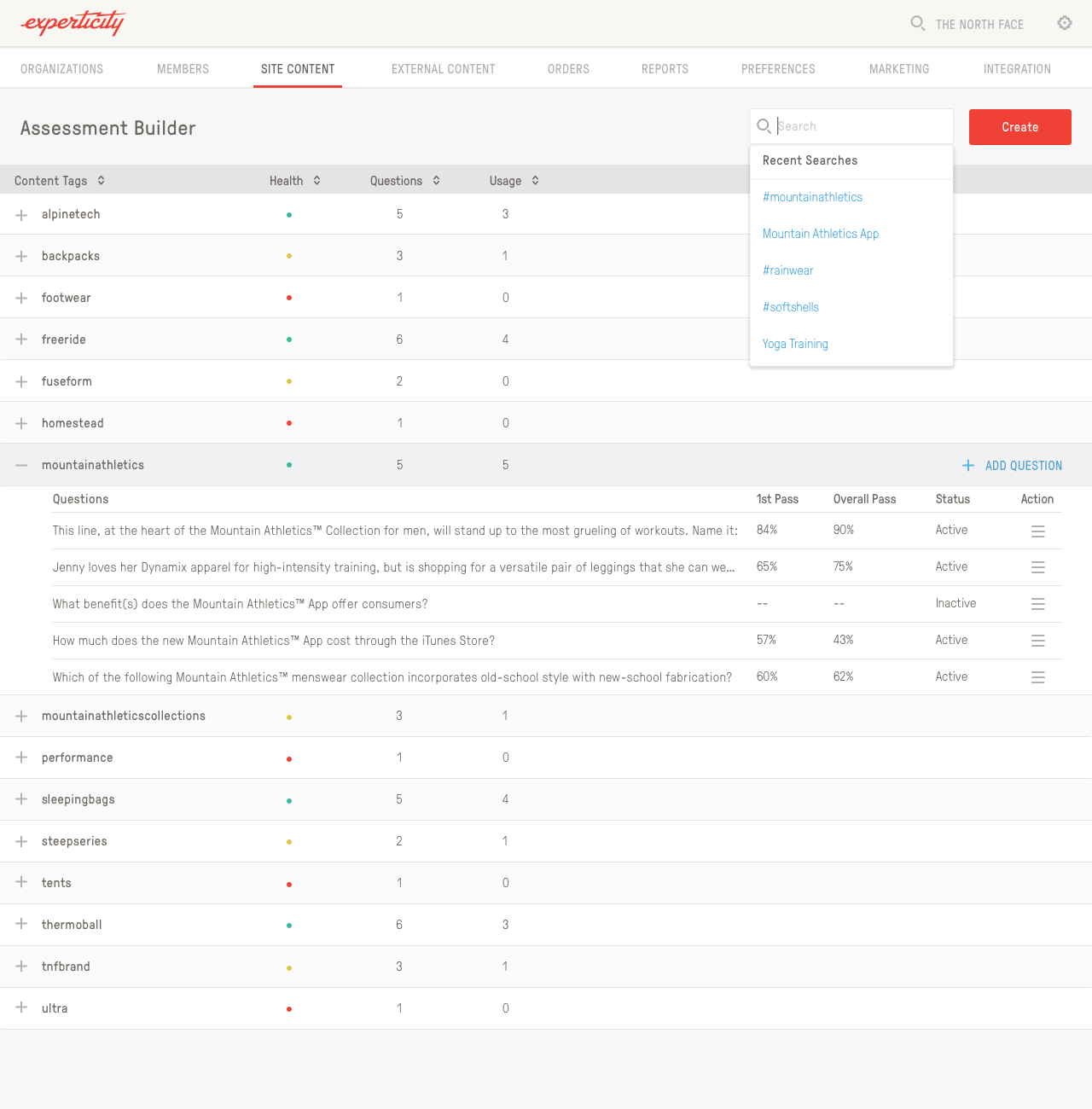
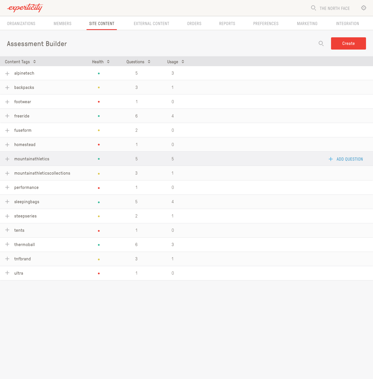
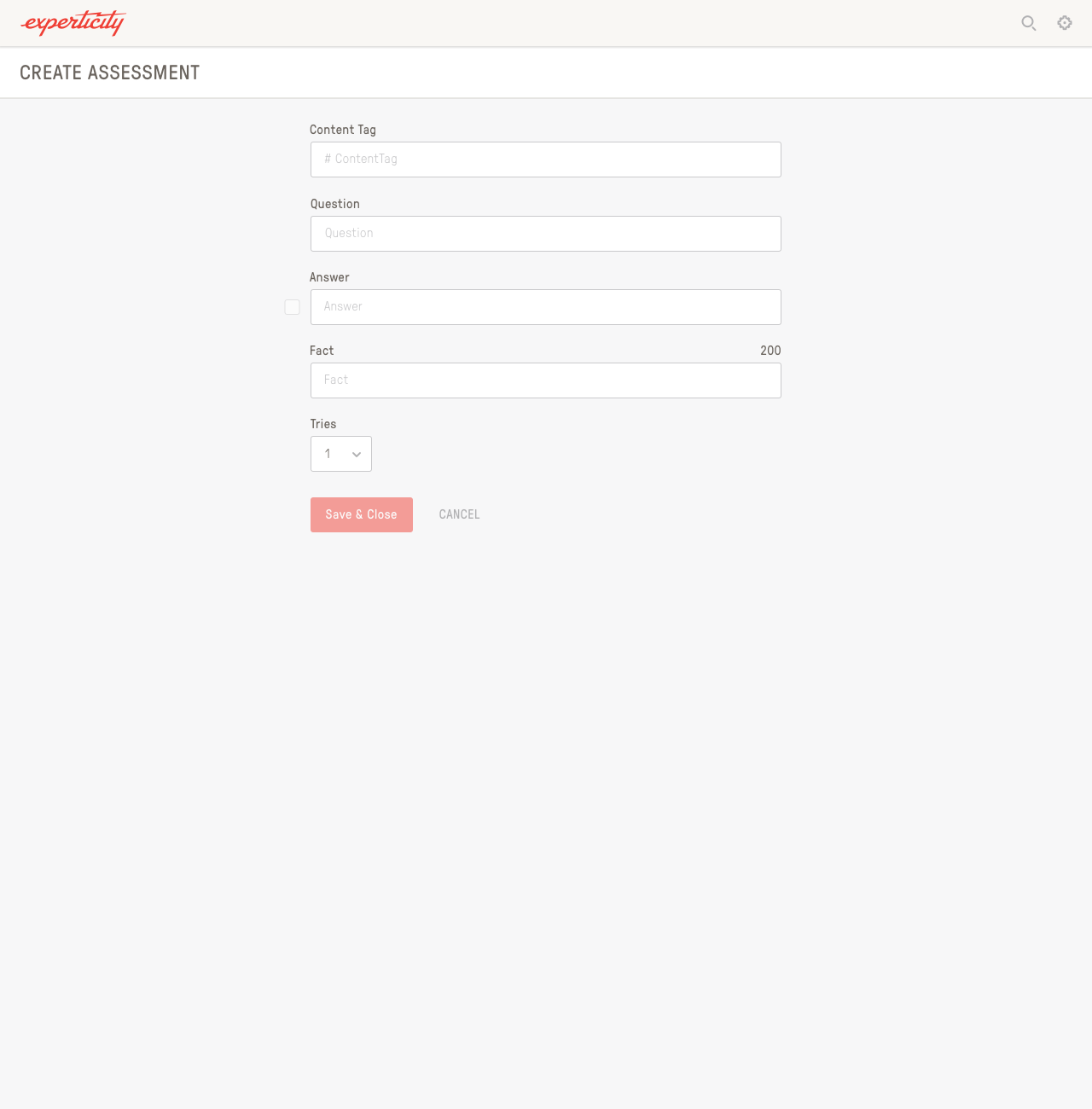
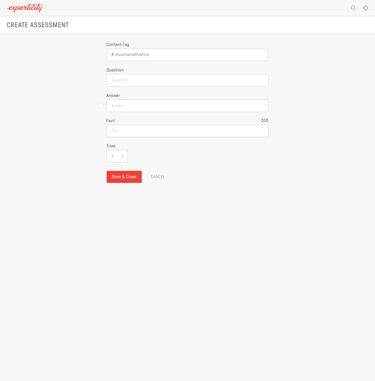
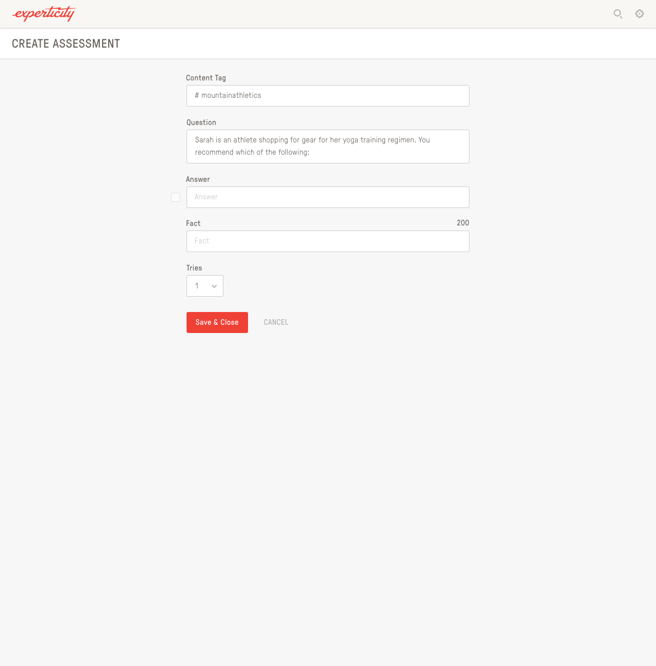
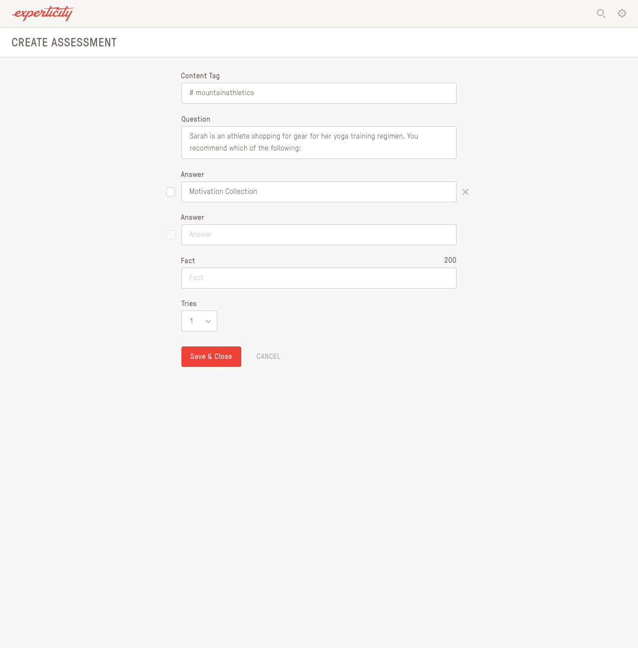
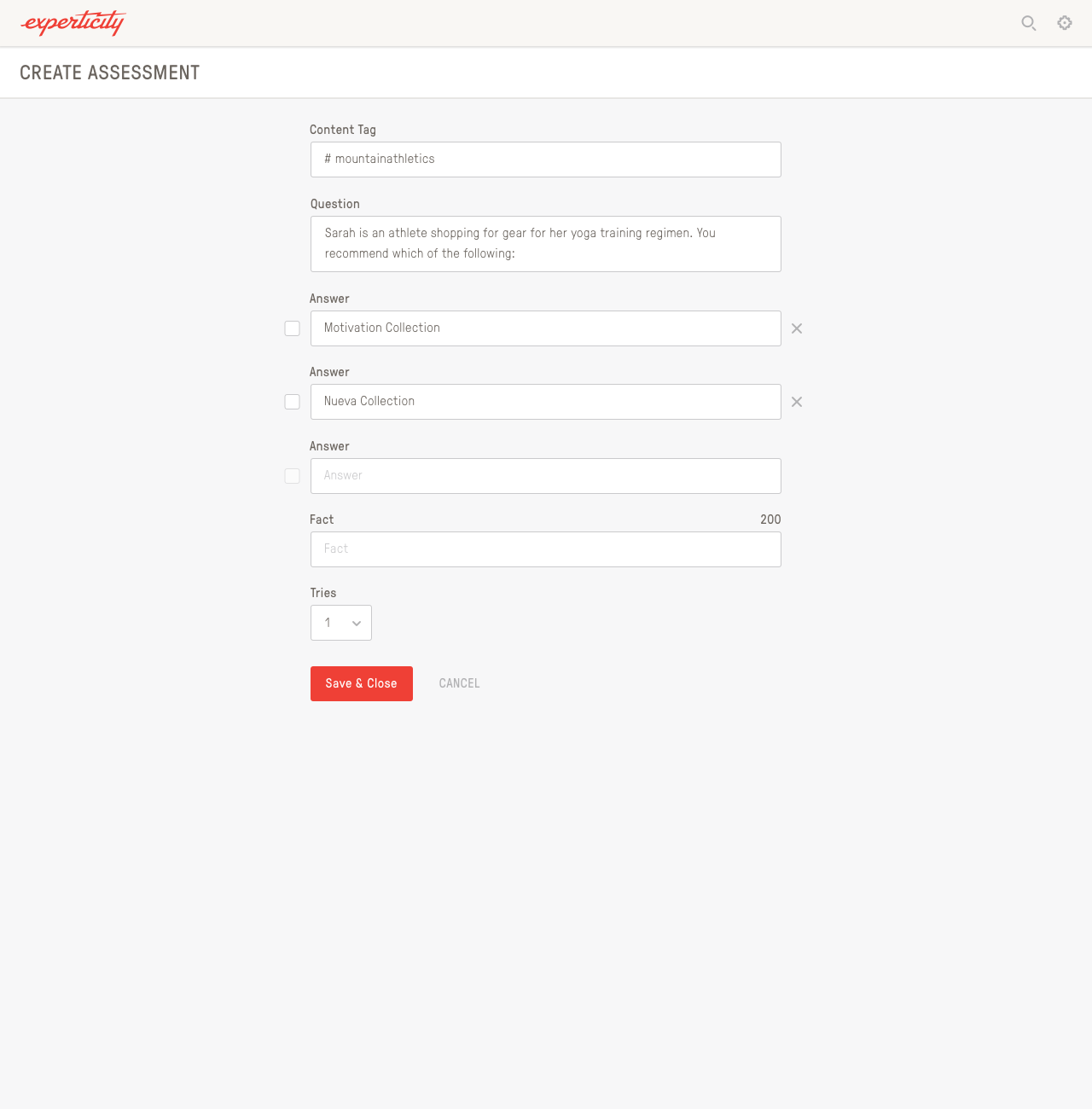
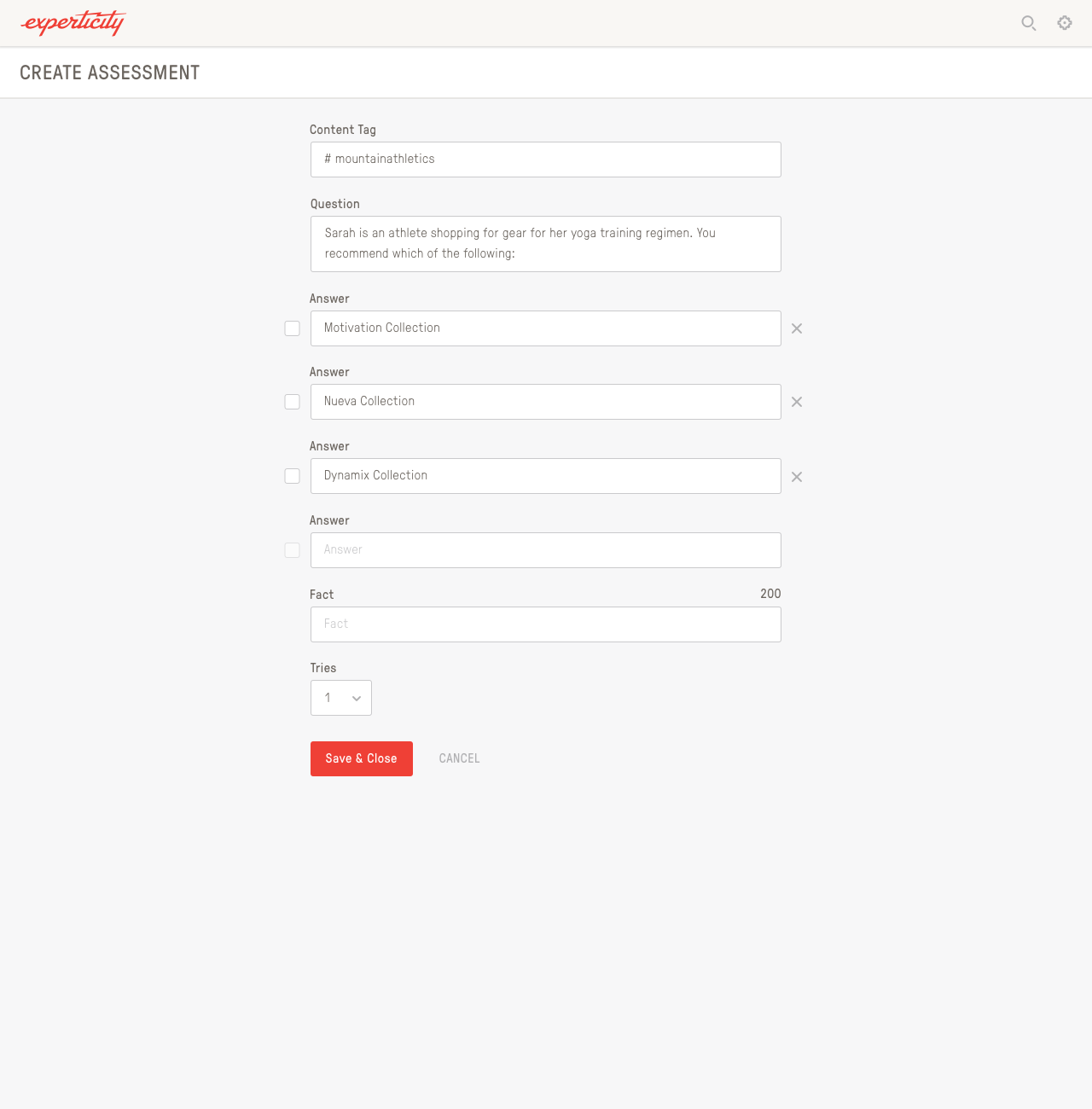

I also designed an Assessment Builder for brand reps to come in and build their own Edu-Games.
404 page
404 page that I designed, puns and all.