Help Center User Research for Blogging Customers
A Case Study
My Role
Discovery • UX research • Sketching + Wireframing • Visual design • Clickable prototypes • User testing
The Problem
Customers are trying to seek out information and not knowing where to go. There are actually several pages that offer help but they’re not easy to get to and it creates confusion on where they should go for help.
The Solution
Create a centralized, user-friendly space where customers can educate themselves and find solutions to their problems by engaging with the specific content (articles/videos/guides/webinars/courses, etc) that meets their needs.
My UX Design Process
Discovery
The initial discovery started by getting to know our primary users, our bloggers. Leading this discovery was our senior lead product designer, Gabby Kibrick, UX content writer, Genevieve Mount, myself, and a couple more product designers Dustin Swanson and Laura Strader, who took turns interviewing. I sat in every interview, taking notes, and helping synthesizing what we just learned. Below you will find the notes that we took for every interview. We had:
13 bloggers
12 hours of conversations
472 google sheet cells of observations
The columns on the google sheet represents everyone we interviewed. The rows represented the questions, grouped into categories, represented by colors (left). After the interviews were complete, we created an affinity map and divided their needs and wants into different themes (right). From those insights, Gabby put together the top 10 needs, and we discovered that one of the solutions to help our bloggers on our site was to create a help center where our users can go and get the help they need to build their websites.
Research
I went straight to work and took inventory of all the pages that we currently have that offers help to our users. What I found were a lot of helpful pages, but very disjointed. Which page offers the help our users need? What’s the difference between our Knowledge Base, Resource Center, and Bluehost Blog? And why aren’t these pages easily found? We have a lot of helpful information but it’s not easy to get that help.
Our UX team has 5 personas. Of the users we interviewed for our blogging research, the personas that best matched them are the two listed below. We also know that most of our users are inexperienced, they struggle with a lot of “firsts”.
For my competitor analysis, I went to every one of our competitors, including GoDaddy, Wix, Squarespace, Weebly, and Webflow, and checked out their help centers.
Ideate
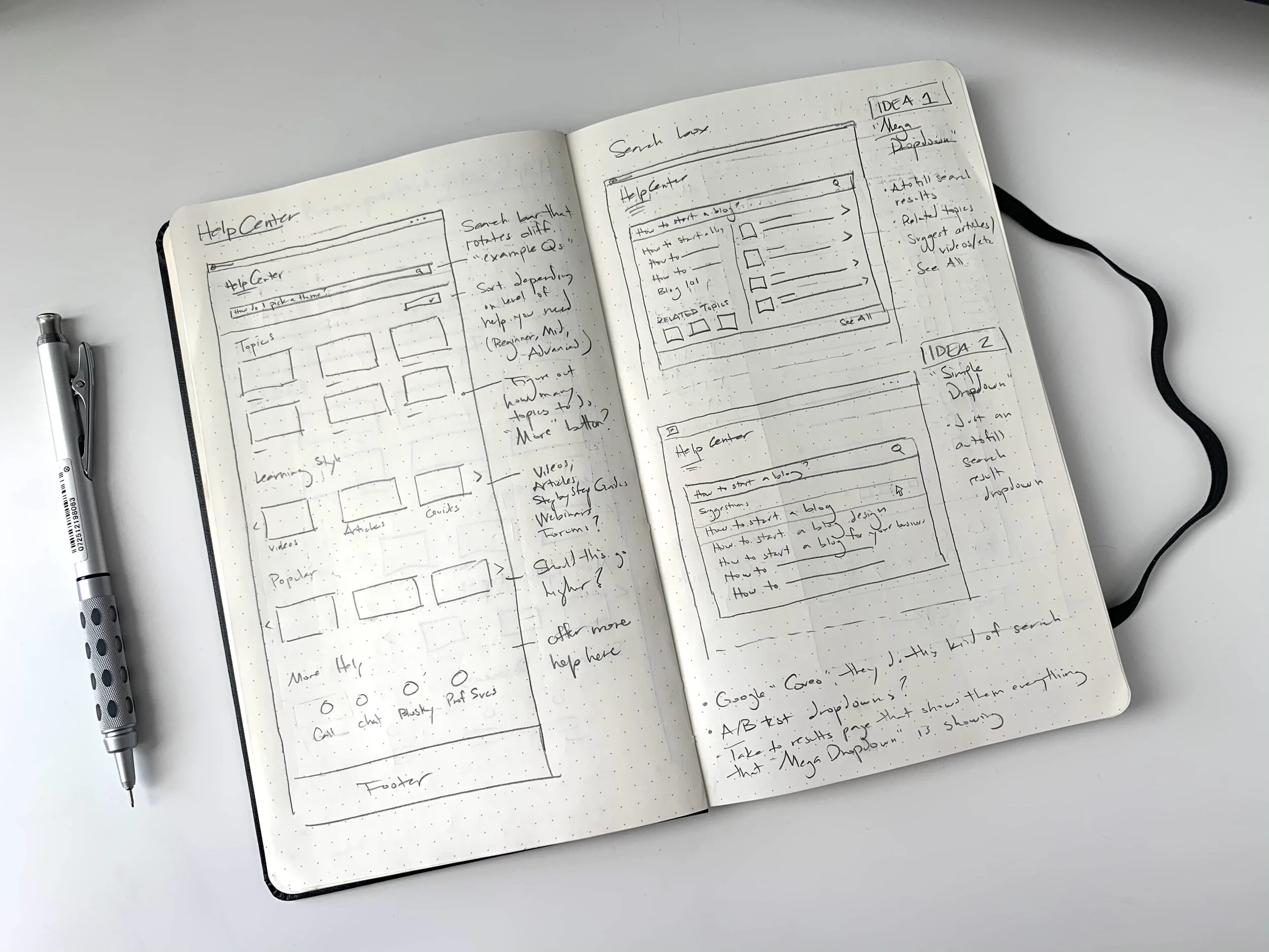
Now comes the fun part. After doing my competitor analysis, I took note of their design patterns, features, and ux. Then I started sketching from those ideas by taking the best of each feature and create something that I felt would best represent us and help our customers.
Here is the Help Center’s information architecture and user flow of the Help Center, including the point of entry, “BOS” homepage (aka Back of Site; after logging in), and “FOS” (Front of Site homepage, not logged in).
Wireframes:
Here’s a quick bird’s eye view of the high fidelity pages of the Help Center.
Prototype + Test
At this stage, my designs were high fidelity, and I created a prototype to start testing with users. I got together with my UX content writers, Joshua Barnes and Genevieve Mount to get the copy right. Then the writers and I met with the UX research team and told them what we wanted to test, what questions we wanted to ask, etc. The research team used Usertesting.com and gathered the results for us.
The prototype presented to the 6 participants was well received and got high overall ratings. The reaction to the Help Center homepage was positive. Here are some key takeaways:
People liked that they can start by category or take a more direct approach and watch videos.
Browsing by learning style (aka, articles, videos, webinars, etc) was noticed and appreciated.
The most helpful section of the page was “Browse by topics”
Move “Browse by topic” higher - switch the order of the Browse by topic and the “For your website” sections
The “Mega Dropdown” and “Article Page” were too crowded and overwhelming to users.
The only hesitation with the prototype was about a new search from an article page - people were expecting to see a search box in the header of each page, but had various ideas how to get to a search from an article page.
When asked about the name for a page like the one they reviewed, Help Center was suggested by 5 out of 6 people. When presented our list of four name options, Help Center was chosen 6 times as the favorite, followed by Resource Center.
The prototype has been updated after we got user feedback.
Next Steps
The next phase is getting stakeholder buy-in. There are conversations going on right now to get this a priority. My content writer, Josh, has been a big help in getting those conversations going. In the meantime, my other content writer, Genevieve and I are updating the “Topics” section to be sure they are the right ones the customers need to see.


